

A while back I watched a local business owner show off their brand-new website.
Slick photography. Lovely fonts. A homepage that genuinely looked the part. He’d paid good money for it, and you could tell.
Then I asked him how many enquiries it had brought in since it launched.
None — not a single one.
The site looked like a million bucks and did absolutely nothing.
That gap — between a website that looks good and a website that earns — is the whole reason this guide exists. Because web design is only half the story, and the half nobody tells you about is the half that pays the bills.
So let me walk you through what web design actually is, what it includes, how the process works, and the part most web designers in New Zealand quietly leave out.
What Is Web Design?
Web design is the process of planning, structuring and styling a website — deciding how it looks, how it’s laid out, and how easily people can use it.
It covers everything a visitor sees and touches: the layout, the colours, the words, the buttons, and the way one page leads to the next.

But a clean definition misses what makes it matter. Your website is usually the first real impression a customer gets of you, and they judge fast.
Around 75% of people admit they judge a company’s credibility on its website design alone — before they’ve read a word about what you do.

So yes, design matters. It just isn’t where the job ends — and that’s the thread running through this whole guide.
Web Design vs Web Development: What’s the Difference?
Web design is the look, layout and feel of a site. Web development is the coding that makes it function. Design decides what the website should be; development builds it so it actually works.
Think of building a house.
The architect draws up the plans and the interior designer picks the layout, the colours, where the light falls. That’s web design.
The builders, the electricians, the plumbers who turn those plans into a standing structure with power and running water — that’s web development.

In bigger projects, web design and web development are two different jobs done by two different people — sometimes two different teams.
A designer maps out how everything should look in a tool like Figma; a developer writes the HTML, CSS and JavaScript that brings it to life.
But for most New Zealand small businesses, the line blurs.
The reason is simple: most local sites are built on platforms like WordPress, Wix or Shopify, where the same person often does both. They drag, drop, style and publish in one tool, no hand-coding required.
So when someone says “I’ll design your website,” they usually mean the whole lot — look and build together.
For this guide, when I say web design, I mean the part you actually care about as a business owner: how the site looks, how it’s organised, and whether it works for the people landing on it.
UI vs UX: The Two Sides of Good Design
UI is what a website looks like. UX is how it feels to use.
Good design needs both, and getting one right while ignoring the other is how pretty websites end up useless.
UI stands for user interface — the visual layer. The colour palette, the typography, the buttons, the imagery, the spacing. It’s the bit people mean when they say a site “looks nice.”
UX stands for user experience — how easy and logical the site is to actually move through. Can someone find what they came for in a couple of seconds? Is it obvious what to do next? Does the thing work the way they expect it to?

Here’s why the difference matters more than it sounds:
A button can be beautiful — perfect colour, perfect shape — and still be a failure if nobody can find it.
Good UX is the quiet engine that turns a curious visitor into an actual enquiry. It’s what walks someone from “just looking” to “filling in the contact form.”
Picture a builder’s website in Hamilton.
The photos of past jobs look fantastic. But the phone number is tucked in tiny text at the bottom of the third page, and the “get a quote” button is the same grey as the background.
Beautiful UI. Broken UX. Every lost click is a job that went to a competitor whose site just made it easy to call.
In fact, research shows 44% of people will head straight to a competitor if they can’t quickly find your contact details.

It’s exactly the kind of avoidable leak that good SEO for builders is built to plug — because getting found is pointless if the visitor can’t work out how to reach you.
The Core Elements of Web Design
Every well-designed website is built from a handful of core elements: layout, colour, typography, imagery, navigation, and content.
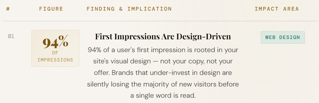
Get these right and the site feels effortless. Get them wrong and visitors leave before they understand what you do — and they leave fast, given that an estimated 94% of first impressions come down to design rather than content.
Here’s what each one does and why it matters.
Layout and visual hierarchy. This is how everything is arranged on the page, and what your eye lands on first.
A good layout guides the visitor — biggest, boldest thing is the most important thing. It’s the difference between a page that feels calm and a page that feels like a cluttered noticeboard.
Colour and typography. Your colours carry your brand and set the mood; your fonts decide whether people can comfortably read a word of it.
Both need to be consistent and easy on the eye. Fancy fonts that nobody can read are a vanity project, not a design choice.
Imagery. Photos, graphics and icons.
Here’s a free tip for any New Zealand business: real photos of your actual work, your actual team, your actual premises beat stock photography every single time.

A genuine shot of your Tauranga workshop builds more trust than a smiling stock model who’s never set foot in the country.
Navigation. The menus and links that help people move around. The test is brutal and simple — can a stranger find what they need in a couple of clicks? If they have to think, you’re losing them.
Content. The words, and this is the element designers most often treat as an afterthought. It shouldn’t be.
Content is what people actually read, what answers their questions, and — crucially — what gets your page found on Google in the first place.
A gorgeous page with thin, vague content is a shop with a stunning window display and empty shelves.
These elements are the same whether you’re a one-person operation or a multi-branch firm.
A dental practice wants the same things a law firm wants: a clear layout, readable text, trustworthy photos, obvious navigation, and content that answers what patients are actually searching for.
(The specifics of how that plays out vary by industry — SEO for dentists leans hard on local trust signals, for instance — but the design fundamentals don’t change.)
Key Web Design Principles
Good web design follows a few non-negotiable principles: it’s responsive, fast, accessible, and easy to scan.
Here’s the part that surprises people — these are the exact same things Google uses to decide whether to rank you. Design for humans properly and you’re already designing for search.
Let me break down the ones that matter.
Responsive design. This means the site automatically reshapes itself to look right on any screen — desktop, tablet, or phone. It’s not optional anymore. More than half of all web traffic now comes from mobile devices, and Google judges your site on its mobile version first.
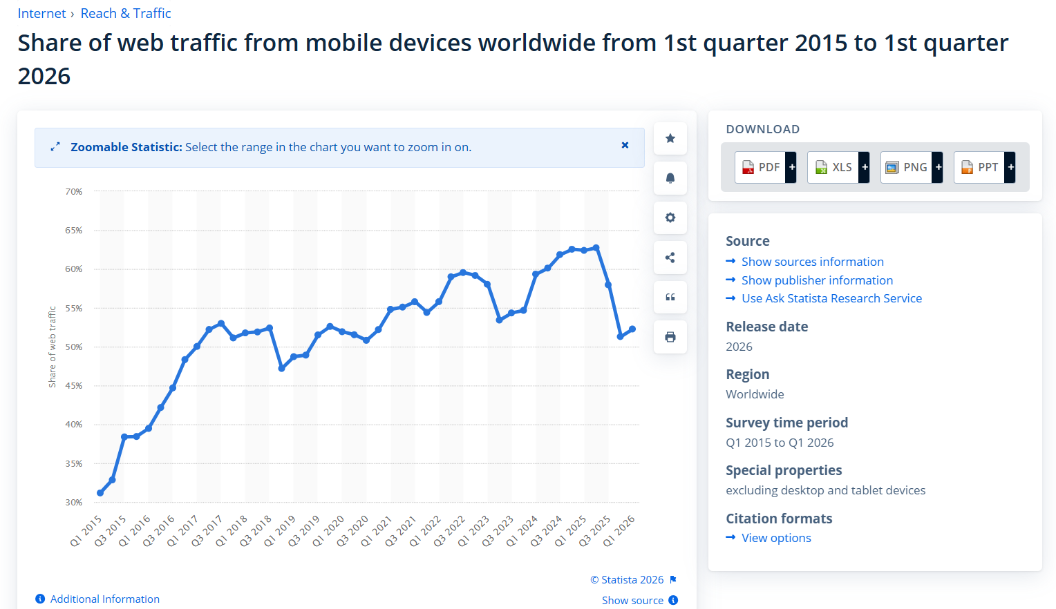
A site that’s a pain to use on a phone is a site that’s quietly turning away most of its visitors.
Fast loading speed. People are impatient, and the numbers are savage. Google’s research found the probability of someone bouncing jumps 32% as a page goes from one second to three seconds to load.
On mobile it’s worse: more than half of mobile visitors abandon a site that takes longer than three seconds.
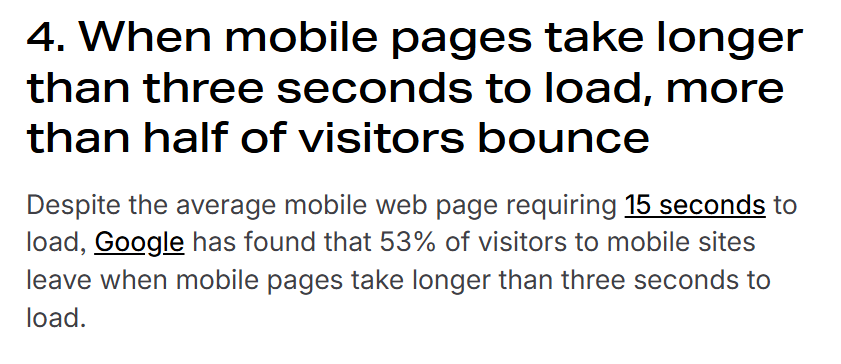
This is where the “3-second rule” comes from — get your site in front of someone fast, or don’t bother.
Speed is partly a design problem (bloated images, too many elements) and partly a technical one, which is why it sits right at the heart of the technical side of SEO.
Accessibility. Designing so that everyone can use your site, including people with visual or motor impairments.
Proper contrast, readable text sizes, alt text on images, keyboard-friendly navigation. It’s the right thing to do, and it happens to make your site clearer for every visitor — and easier for Google to understand.
Clarity and scannability. Nobody reads a website top to bottom. They scan. Good design respects that with clear headings, short paragraphs, white space, and one obvious next step per page.
Most of the “golden rules” of web design come back to this one idea — make it instantly obvious what this is and what to do next.
Now connect the dots: Responsive, fast, accessible, clear — that’s good design for a human being.
It’s also, almost word for word, what Google rewards with rankings. So nailing these principles isn’t just polish. It’s the foundation of getting found.
Foundation, though — not the finished building. Hold that thought.
The Web Design Process, Step by Step
A proper web design process runs in clear stages, from working out what the site is for through to launch.
This is also the honest answer to “what does a web designer actually do” — it’s a lot more than picking nice colours. Here’s how a good build runs, start to finish.
Step 1 — Strategy and goals. Before a single pixel is placed, you work out who the site is for and what you want it to do.
Generate enquiries? Take bookings? Sell products? A site with no defined goal ends up being a pretty brochure that does nothing — which is exactly how we started this guide.
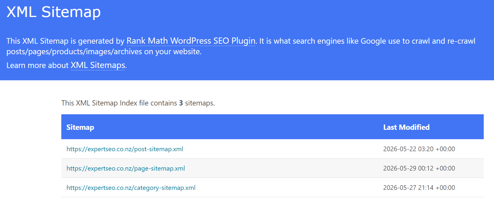
Step 2 — Structure (the sitemap). Next you map out the pages and how they connect.
Home, services, about, contact, plus whatever your business needs. This is the skeleton everything hangs off.
Step 3 — Wireframing. A wireframe is a rough, no-frills blueprint of each page — boxes and labels showing where things go, with zero styling.
It sounds basic, but sorting the layout before the visuals saves you redoing the pretty stuff three times.
Step 4 — Visual mockups. Now the brand goes on. Colours, fonts, images, real spacing — the designer turns those wireframes into something that looks like the finished site, so you can see and approve it before anyone builds it.
Step 5 — Build and development. The approved design gets turned into a working website, either with code or inside a platform.
If you’re getting a site built locally — say website design Hamilton for a Waikato business — this is the stage where the visuals become a real, clickable site.
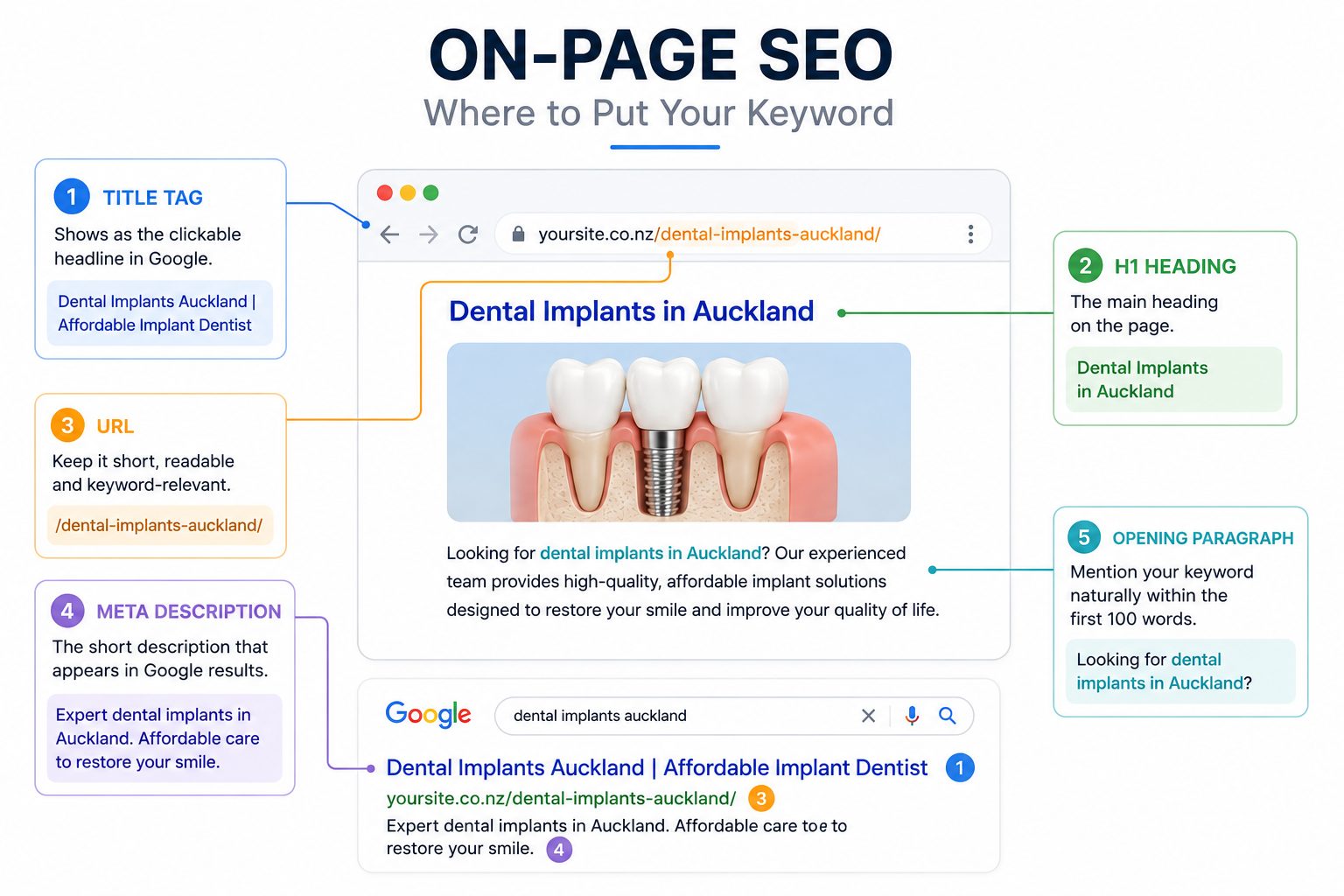
Step 6 — Content and on-page setup. The words go in, and this is where good builds and lazy ones separate. Strong, clear content that answers real questions does double duty: it helps your visitors and it sets up your rankings.
This is the moment on-page optimisation should be baked in, not bolted on six months later.
Step 7 — Launch. Final checks, then the site goes live. Test every link, every form, every page on a phone.
And here’s the thing most people get wrong about that last step. Launch feels like the finish line, but it’s really the starting line.
A live website is a shop that’s just opened its doors — on a street where, right now, nobody knows it exists.
Which brings us to the part of web design almost nobody tells you about.
Design Is Only Half the Job
A beautiful website is worthless if nobody sees it and it doesn’t turn visitors into customers.
Design gets you in the door.
Getting found gets you traffic. Turning that traffic into enquiries gets you paid.
Most web design conversations stop at the first one — and that’s why so many good-looking sites earn nothing.
Let me say the quiet part out loud:
Having a website does not mean your market will find it. None of it.
Putting a site online and expecting customers to arrive is like printing gorgeous business cards and leaving the whole box in your garage.
The card looks great. Nobody’s holding one.
Two things bridge that gap, and neither is web design.
The first is getting found, which is what SEO is for — optimising your site so that when someone in your market searches for what you do, you’re the one they find.

That’s the difference between a site that sits in silence and one that steadily grows its traffic with people who were already looking for you.
The second is converting, often called CRO (conversion rate optimisation) — making sure the people who do land on your site actually take action instead of drifting off.
Clear offers, obvious calls to action, trust signals, a path that leads somewhere.
I’ll tell you how I know this matters more than a pretty layout.
I’ve gone up against competitors — in New Zealand and in the United States — with far more beautiful websites than mine.
Mine is tidy, sure. Easy on the eye, up to a point.
But I pour my real effort into SEO and conversion, because I want my website to make me money, not just sit there looking nice.
And I’ve beaten those prettier sites again and again, because they were gorgeous and invisible while mine was decent and found.
That holds even in the toughest markets — SEO in Auckland is the most contested patch in the country, and it still comes down to who’s actually findable, not who’s prettiest.
Our SEO company is a good example of it.
The domain is under a year old, going up against New Zealand agencies that have been building their sites for a decade.

It’s not the prettiest site in the race. It’s the one that ranks.
And the same principle built results long before this — I helped grow a health website from zero to over 20,000 visitors a month, and a scam-awareness site to more than 5,000 visitors a day.

Neither won on looks. Both won on being found and being useful.
The design industry skips all this for a simple reason: a pretty site is what gets shown off, signed off, and paid for.
It’s the deliverable everyone can see. Getting found and converting is slower, less glamorous, and a different skill set entirely — so plenty of designers hand over a lovely site, call the job done, and leave the actual business outcome to chance.
And here’s the bit that’ll save you real money.
In New Zealand, when a web designer tells you they “did the SEO” on your site, the overwhelming majority of the time, they didn’t.
They ticked a box, filled in a page title, maybe installed a plugin, and called it SEO.
Proper SEO is its own discipline. If you want your website to actually pull in customers, get that part done by people who do SEO for a living — not as a free add-on at the end of a design job.
Design gets you a website. Strategy gets you a business. That’s the line nobody puts on the invoice.
Types of Web Design and Common Tools
Most web design falls into three types — responsive, adaptive, and static — and it’s usually built with tools like WordPress, Wix, Shopify, Webflow or Figma.
You don’t need to be an expert in any of them, but knowing the lay of the land helps you ask the right questions.
The three main types, quickly:
- Responsive design — the site fluidly resizes to fit any screen. This is the modern standard, and what you should expect by default.
- Adaptive design — the site loads one of several fixed layouts depending on the device. Less common now, but still around on older builds.
- Static design — a fixed-width site that looks the same regardless of screen. Fine for very simple, rarely-updated pages; a poor fit for a business chasing customers on mobile.
On tools, the big practical decision for most local businesses is template-and-builder versus fully custom.
A platform like Wix or WordPress lets you start from a template and customise — faster and cheaper. A custom build is designed from scratch — more control, more cost.
Most of these platforms run on a CMS, a content management system, which is just the dashboard you log into to update your own pages without touching code.
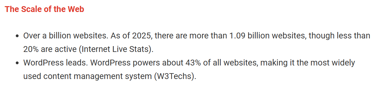
WordPress is the most common — it powers around 43% of all websites — and a big reason businesses choose it is that, done right, SEO on WordPress is genuinely strong out of the box.
Here’s my honest take on the template-versus-custom debate, though: it matters far less than people think.
A tidy template that’s found by your market and converts will out-earn a stunning custom build that nobody visits, every day of the week. Spend your design budget getting the basics clean, then put the rest into being found.
Common Web Design Mistakes NZ Businesses Make
Most struggling New Zealand business websites repeat the same handful of avoidable mistakes. None of them are about talent or budget. They’re about focus — putting it all on looks and none on outcomes.
The usual suspects:
- Pretty over found. Spending the entire budget on visuals and nothing on getting traffic. A 10/10 site nobody sees loses to an 8/10 site that ranks.
- Slow and clunky on mobile. A site that crawls on a phone, when most of your visitors are on phones. Every wasted second is a visitor gone.
- No clear call to action. Pages that look nice but never tell the visitor what to do next. Call? Book? Buy? If it’s not obvious, it won’t happen.
- Treating launch as the finish. Going live and then doing nothing — no content, no SEO, no updates. The site slowly sinks while newer, busier competitors climb past it.
- Trusting “we did your SEO” without proof. Taking a designer’s word that the SEO is handled, when nine times out of ten it isn’t.
The good news is every one of these is fixable, and most of them surface fast once someone who knows what they’re looking at runs an SEO audit over the site. You can’t fix what you can’t see.
Do You Need a Professional, or Can You DIY It?
You can build a basic website yourself with a builder, and for some businesses that’s genuinely fine.
But the moment you need that site to actually generate business — to be found and to convert — is the moment most New Zealand business owners should bring in help.
DIY makes sense when the stakes are low. A very small operation, a simple one-pager, a side project, something you just need to exist online. Modern builders are good enough that you can put together a respectable site over a weekend.
Bringing in professional website design makes sense when the website has a job to do — when it’s meant to be a real source of customers, not a digital business card.
And here’s what to look for, because this is where people get burned: don’t just hire someone who makes things look good.
Hire someone who understands getting found and converting, or partner your designer with someone who does. A site built for business outcomes is worth ten built for looks alone.
A service business chasing customers through SEO in Christchurch, for example, will spend more proving itself in search over the following months than it ever did on the build. That ongoing work is the part to budget for.
If you’d rather hand the whole thing off, that’s exactly the gap we fill. We don’t just want your site to look the part — we build it to be found and to bring in real enquiries.
That’s where professional SEO help and the whole web build come together.
Because a website should be the hardest-working salesperson you’ve got — and a good-looking one that sits idle is just an expensive ornament.


