

You’ve seen this website before.
It looks the part. Clean design, nice photos, a logo that took three rounds to get right. The owner paid good money for it and they’re proud of it — as they should be.
But six months on, it’s bringing in next to nothing. No enquiries. No calls. A trickle of traffic that mostly turns out to be the owner checking their own site on their phone.
The problem was never how it looked. It was everything that got skipped before, during and after the design — the parts nobody put on a checklist.
A website has one job: to be found on Google and turn the people who find it into customers. Get the order of operations wrong and all that lovely design just becomes an expensive online business card nobody sees.
This is the checklist I run through when I build a site to do an actual job.
It covers strategy, design, the build, content, SEO and launch — in the order that matters — written for New Zealand businesses, with real examples and the bits most “checklists” leave out.
Work through it on your own build, or use it to hold your designer to account.
What a Web Design Checklist Actually Is
A web design checklist is a step-by-step list of everything a website needs — across strategy, design, build, content and SEO — to launch as a site that brings in business, not just one that looks nice.
That’s the definition. Here’s the catch.
Search for one and most of what you’ll find is a process overview wearing a checklist costume.
Ten headings that read “strategy, design, development, launch” with a paragraph under each. Useful background. But you can’t actually tick anything off it.
A real checklist gives you concrete items you can check, phase by phase: is the message clear, is every service on its own page, does the thing load fast, does each page ask for the next step.
And it’s worth doing, because design carries more weight than people think.
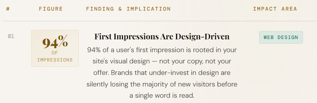
Around 94% of first impressions come down to design — visitors size up the whole business on it within a heartbeat. A checklist makes sure the parts that earn that snap judgement, and the parts that earn rankings, both get done.
Phase 1: Strategy and Foundations
Before anyone picks a colour or a template, four things need to be locked: what you do, who it’s for, what you want visitors to do, and how the site is structured.
This is the phase everyone wants to skip. It’s also the one that decides whether the site works. Get it right and the rest of the build has something to aim at. Get it wrong and no amount of pretty design saves it.
Nail your message — the clarity test
Here’s the test I put every homepage through: can a first-time visitor tell what you do and what problem you solve within a few seconds of landing, without scrolling?

If they can’t, nothing else matters. They’ve already gone.
People judge fast and they judge hard — around 75% of people decide whether they trust a business based on its website.
So your headline shouldn’t be a clever slogan nobody understands. It should say, in plain words, what you do and who you help. “Cambridge builders who actually turn up” beats “Crafting spaces, building dreams” every day of the week.

Know your goal and your ideal customer
Every site needs one main job. Quote requests? Bookings? Online sales? Newsletter signups?
Pick the primary one, because it changes how you design every page.
Then get specific about who you’re building for. A site aimed at homeowners looking for a plumber looks and reads nothing like one aimed at commercial property managers.
Write down who your ideal customer is and what they’re worried about before you brief a single page.
Map your site — a page for every service
This one’s both a usability move and the foundation of your rankings: every service and subservice gets its own page.
If you’re a builder doing new builds, renovations and light commercial work, that’s three pages, not one “Services” page with three paragraphs.
Google can only rank a page for what that page is actually about. One page trying to cover everything ranks well for nothing.
It matters more locally than people realise. Take a builder commissioning website design in Hamilton — the ones who win search aren’t the ones with the biggest site.
They’re the ones whose site has a clear, dedicated page for each thing they do, in each area they serve.
Plan content around what people actually search
Before you write a word, find out what people are actually typing into Google to find a business like yours. Then build pages around those terms.
This is the step that separates a site built to rank from one that just exists. You’re not guessing what to call your pages — you’re naming them after real demand, so they show up when someone goes looking.
Phase 2: Design and UX That Guides Visitors Toward Action
Good design does a job beyond looking nice: it moves the visitor toward a decision. Every screen should make the next step obvious — through layout, flow, and consistency, on any device.
Layout and visual hierarchy
People don’t read websites. They scan them. So the most important thing on each page needs to be the most obvious — biggest, boldest, highest up.
Your eye should land on the headline, then the value, then the button, in that order, without thinking about it.
Story flow — each section leads into the next
This is the bit almost every checklist misses. A good page reads like a conversation, not a pile of blocks.
The headline raises a question, the next section answers it and raises the next, and so on, until the only natural thing left to do is get in touch.
When you map a page, ask of every section: what question does this leave the reader with, and does the next section answer it? If a section doesn’t move them forward, it’s in the way.
Brand consistency
Same colours, same fonts, same style of imagery, every page. Consistency is what makes a site feel trustworthy and put-together rather than stitched from three different templates. Pick a small colour palette and two fonts and hold the line.
Mobile and responsive
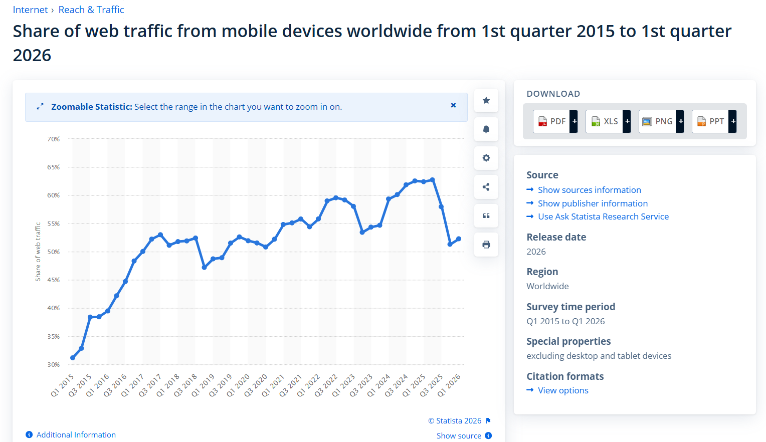
This isn’t optional anymore. Around 60% of web traffic now comes from phones, and Google ranks your site based on its mobile version first. If your site only looks good on a laptop, you’ve built it for the minority.
Check every page on an actual phone, not just a shrunk-down browser window. Tap every button with a thumb. Make sure text is readable without pinching.
Take an Auckland café getting web design in Auckland sorted: most of their visitors are hungry people on a phone, standing on a footpath deciding where to eat.
If the menu and the “book a table” button aren’t dead easy to tap, that booking goes to the place down the road.
Accessibility
Building a site that works for people with disabilities is the right thing to do, and it also widens your audience and helps your SEO — the same things that help screen readers (proper headings, alt text, good colour contrast) help Google too.
Most sites get this badly wrong. In the latest audit of a million home pages, 95.9% had detectable accessibility failures. The basics fix most of it: readable contrast, alt text on images, labels on form fields, and a logical heading structure.

Phase 3: Build and Technical Foundations (Where Rankings Are Won or Lost)
The technical build decides whether Google can even find, read, and rank your site. Get the platform, speed, crawlability and security right at build time — fixing them later costs far more.
I’ll be blunt here, because this is where I’ve spent a decade and where most NZ sites leak rankings.
I built our SEO company on a brand-new domain and it started ranking — and getting cited in AI Overviews — inside its first year. Not because of a huge budget. Because it was structured to rank from the very first page.
Platform, hosting and domain
Pick a platform you can actually manage and that Google handles well — WordPress is the safe default for most NZ businesses.
Choose hosting that’s fast and reliable, ideally with NZ-based or nearby servers so local visitors aren’t waiting on a connection halfway around the world. Lock in a clean domain name and an SSL certificate (the padlock) as standard.
Page speed
Speed is a ranking factor and a conversion factor at the same time.
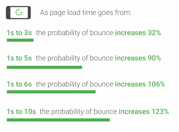
According to Google, as a page’s load time goes from one to three seconds, the chance of a visitor bouncing jumps 32%. Every second you shave off keeps more people on the page and ranks you higher.
Compress your images, don’t load a dozen heavy plugins, and use caching. Then test it on a real tool and keep tuning until it’s quick.

Technical SEO from day one
Make sure Google can crawl and index every page you want ranked. That means a clean URL structure, a working sitemap, no pages accidentally blocked, and proper headings on every page.
This is the technical side of SEO, and it’s far cheaper to get right during the build than to retrofit after launch.
The design choices that quietly hurt your rankings
Some of the prettiest design trends are ranking poison. Watch for these:
- Text baked into images, so Google can’t read it
- A single long scrolling page instead of real, separate pages it can rank
- A homepage that looks gorgeous but has no actual words on it
- Fancy menus or content that only load after a click, where search engines never see them
- No clear heading structure, just styled text that looks like headings but isn’t
Good design and good SEO aren’t enemies. But when a designer optimises only for looks, this is where it costs you.
Phase 4: Content, SEO and Conversion on Every Page
Every page has to earn its ranking and ask for the next step. That means content that ranks, on-page SEO done properly, and one clear call to action.
Write pages that rank and read well
Match each page to what the searcher actually wants. Someone searching “emergency electrician Wellington” wants a phone number and reassurance you’ll come now — not a 2,000-word history of your company.
Give them the thing they came for, fast, then back it up with the detail that builds trust.
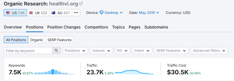
Good content compounds, too. I grew the HealthVI results from zero to over 20,000 monthly visitors largely on the back of pages built this way — useful, structured, and aimed squarely at what people were searching for.
On-page SEO basics
Every page needs the fundamentals handled: a keyword-led title tag, a clear H1, a logical heading structure, a meta description that earns the click, and internal links to related pages.
This is on-page optimisation, and on a new build it takes minutes per page if you do it as you go.
A clear call to action on every page
Never leave a visitor at a dead end. Every page should make the next step obvious — call, book, enquire, buy.
One primary action, repeated where it makes sense, phrased as a benefit (“Get your free quote”) rather than a shrug (“Submit”).
A reader who’s convinced and then can’t easily find the button is a lead you’ve thrown away.
Phase 5: Your Pre-Launch Checklist
A final sweep catches the things that embarrass you after launch. Before you hit publish, run through this:
- Test every form and CTA — actually submit them and confirm the email lands
- Check every page on a real phone and a real desktop
- Run a final speed test and fix anything slow
- Confirm Google Analytics and Search Console are connected
- Make sure the site is set to be indexed (it’s astonishing how many launch with “discourage search engines” still ticked)
- Proofread everything, then proofread the headlines again
- Check every link goes where it should
The classic one I see: a beautiful new site, live for a month, and the contact form was never connected to anyone’s inbox. Every enquiry vanished. Test the forms.
Phase 6: After Launch — Tracking, Maintenance and Growth
Launch is the start line, not the finish. Once the site’s live, you keep it healthy and you keep feeding it.
Track what matters — enquiries, calls, and which pages bring them in — so you know what’s working. Keep the site maintained with regular updates, backups and security checks.
And keep publishing useful content, because a site that grows its content grows its rankings.
That last part is the long game. A new website gets you in the race; consistent content and professional SEO help is what moves you up it over the following months.
New Build vs Redesign — How the Checklist Changes
If you’re rebuilding an existing site rather than starting fresh, the whole checklist still applies — but you add a few steps to protect what already works.
The big one: don’t throw away rankings you’ve already earned. Before you touch anything, run an SEO audit of the current site to see which pages bring in traffic and what they rank for.
Keep those URLs (or redirect them properly), keep the content that earns visits, and carry the wins across to the new build.
A redesign that ignores this is how businesses launch a gorgeous new site and watch their traffic fall off a cliff the same week.
The Full Web Design Checklist in One Place
Here’s every check from this guide, condensed into one list you can run your project through.
Strategy and foundations
- ☐ Message is instantly clear — a stranger knows what you do in seconds
- ☐ One primary goal for the site is defined
- ☐ Ideal customer is written down
- ☐ Every service and subservice has its own page
- ☐ Pages are planned around real search demand
Design and UX
- ☐ Clear visual hierarchy on every page
- ☐ Each section flows naturally into the next
- ☐ Brand is consistent (colours, fonts, imagery)
- ☐ Fully responsive and tested on a real phone
- ☐ Accessibility basics covered (contrast, alt text, labels, headings)
Build and technical
- ☐ Right platform and fast, reliable hosting
- ☐ Clean domain and SSL certificate
- ☐ Page speed tested and optimised
- ☐ Site is crawlable and indexable, with a clean structure
- ☐ No design choices that block Google (image-only text, hidden content)
Content, SEO and conversion
- ☐ Each page matches what the searcher wants
- ☐ On-page basics done (title, H1, headings, meta, internal links)
- ☐ One clear call to action on every page
Pre-launch
- ☐ Forms and CTAs tested
- ☐ Checked on phone and desktop
- ☐ Analytics and Search Console connected
- ☐ Set to be indexed
- ☐ Proofread and links checked
Post-launch
- ☐ Tracking enquiries and key pages
- ☐ Maintenance, backups and security in place
- ☐ Ongoing content plan to keep growing
Should You DIY or Hire a Web Designer?
You can absolutely build a decent site yourself with a modern website builder — plenty of NZ small businesses do, and for a simple brochure site that’s a fine call.
But if the website is core to how you get customers, the cost of getting it wrong outweighs the cost of doing it properly.
A site that’s built to rank and convert from the foundation up is a different animal to one that just looks tidy. If you want it done right the first time, that’s where professional website design earns its keep.