

Picture someone landing on your website.
They’ve got a problem and a few seconds of patience. They glance at the top of the page, hunting for the one thing that’ll help them — a price, a service, a way to book.
If they can’t spot it fast, they don’t email you to ask. They hit back and try the next business in the search results.
That moment lives or dies on your navigation. It’s the menu, the links, the signposts that move people through your site — and most owners treat it like furniture. Set it once, never think about it again.
Here’s the thing about navigation: it’s quietly doing two jobs at once. It decides whether visitors find what they came for, and it decides which of your pages Google can find and rank.
Get it right and both reward you. Get it wrong and you bleed leads you never even knew you had.
This guide walks through the navigation best practices that actually matter, explained the way an SEO company sees them — what each one is, why it helps your visitors and your rankings, and exactly how to fix it yourself.
What website navigation actually is
Website navigation is the system of menus and links that helps people — and search engines — move around your site and find what they’re after.
Most people picture the menu bar across the top and stop there. But navigation is broader than that. It works in three layers:
Primary navigation is your main menu, usually in the header. This is the big one — Home, Services, About, Contact, and so on.
Secondary navigation is everything that helps people move around once they’re deeper in: dropdowns, sidebars, breadcrumbs, and the links sitting inside your content.
Footer navigation is the set of links down the bottom — the stuff people scroll to find when they’re looking for it specifically.
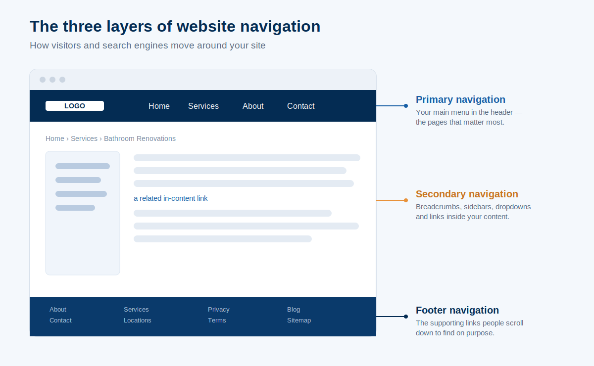
When all three work together, a visitor never has to think about how to get somewhere. They just go. And the links holding it together are part of your wider internal link structure, which is doing real SEO work behind the scenes — more on that later.
Why your navigation matters more than you think
Good navigation drives leads and rankings. Bad navigation quietly kills both. That’s the whole reason this is worth an afternoon of your time.
Start with the human side. People judge fast — scary fast.
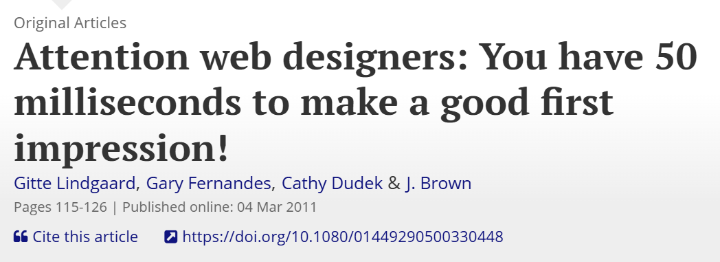
Research that Nielsen Norman Group points to found visitors form an opinion about a website in around 50 milliseconds. That’s a twentieth of a second, before they’ve read a word.
A cluttered, confusing menu in that first glance and you’re already on the back foot.
Then there’s the search side, and this is where it gets interesting for a business. Your navigation is the most repeated set of links on your entire site. It appears on every page.
That means Google leans on it heavily to work out what your site is about, which pages matter most, and how authority should flow between them.
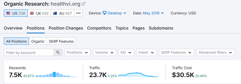
In 2017, I started a project with my former business partner and SEO mentor, Ian Pribyl — a health website called HealthVI.
We grew the HealthVI results from nothing to over 20,000 visitors a month, and a big part of that was structure: making sure every important page was easy to reach, for readers and for Google.
When people and crawlers can both find your best stuff, that stuff gets used and it gets ranked.
It’s the same idea behind our SEO company, a domain under a year old that’s outranking NZ agencies with a decade’s head start. Clean architecture isn’t the whole story, but it’s where the story starts. Navigation is the front door to all of it.
Keep your main menu short — and forget the magic number
Keep your main menu short enough that nothing important has to fight for attention. You’ll read everywhere that the rule is “seven items or fewer.” That rule is useful, but it’s not gospel.
Here’s the honest version. The “seven” comes from an old idea about how much people can hold in their head at once.
But the actual UX authority on this, Nielsen Norman Group, calls the magic number a myth — what matters is whether each item is clear and earns its spot, not whether you’ve hit some exact number.
A tight, logical menu of nine beats a confusing menu of five every time.
Shorter usually wins for two reasons.
For your visitors: every extra option is one more decision. Pile on twelve top-level links and you’ve handed them a wall of choices instead of a clear path.
For your SEO: this is the part most guides skip. Your homepage passes authority down through its links. Split that across fifteen menu items and each page gets a thin slice.
Trim it to the handful that actually matter and each of those pages gets a thicker one. Fewer, better links concentrate the power where you want it.
A Hamilton builder I looked at had a twelve-item menu — every service, the blog, a gallery, two different contact links, the lot.
We grouped the services under one “Services” parent with a dropdown, pushed the gallery and policies to the footer, and got the main menu down to six.
Cleaner for the customer, and more focused for Google. That kind of structural tidy-up is the foundation of SEO in Hamilton for any local trade competing on a small set of money pages.

How to do it: list every item in your main menu. Mark the three or four that directly make you money or answer the most common question.
Group the rest under sensible parents or demote them to the footer. If an item doesn’t earn its place up top, it doesn’t belong up top.
Use labels people actually understand and search for
Your navigation labels should say exactly what’s behind them, in the words your customers use — not your internal jargon, and not clever wordplay nobody recognises.
This trips up so many businesses. They label a menu item “Solutions” when they mean “Bathroom Renovations.” They write “Engage” when they mean “Book a Consult.”
Clever to write, useless to read. A visitor scanning your menu shouldn’t have to guess what a word means.
There’s a direct SEO bonus here too. Because your labels are links sitting on every page, plain, descriptive labels that match what people actually search help Google understand what each page is about.
“Bathroom Renovations” tells a search engine far more than “Solutions” ever could.
That overlap between clear labels and search relevance is one of the simplest wins in on-page optimisation — you’re helping the reader and the crawler with the same change.
Take a dental practice. A menu item buried under “Patient Portal” or “Resources” hides the one thing a new patient wants: to book.
Relabel it “Book Online” and you’ve made the path obvious and lined the page up with what people type into Google. That’s the kind of small, high-impact fix that lifts SEO for dentists without touching a single ranking factor on purpose.
How to do it: read each menu label and ask, “Would a stranger know exactly where this goes?” If there’s any doubt, rename it in customer language. Name your pages from the search box, not the org chart.
Put your navigation where people expect it — and keep it consistent
Put your main menu in the header, make your logo link back to the homepage, and keep the navigation identical on every page. People shouldn’t have to relearn your site as they move through it.
There’s a reason nearly every website follows the same conventions: visitors have been trained by thousands of other sites. The menu lives across the top or just under the header.
The logo, top-left, always takes you home. Break those patterns to be different and you don’t look creative — you look broken.
A few conventions worth locking in:
Make the logo a homepage link. It’s the universal “take me back to the start” button and people expect it to work.
Show people where they are. Highlight the current page or section in the menu so visitors always know their spot.
Consider a sticky header on long pages, so the menu stays reachable as people scroll. Handy on a long service page; less necessary on a short one.
The big one is consistency. Your menu should be the same on your homepage, your service pages, and your blog. The moment it changes between pages, people feel lost even if they can’t say why.
Get your mobile navigation right
Most of your visitors are on a phone, so design your navigation for a thumb first. On a small screen that usually means a tidy menu tucked behind a hamburger icon, with your most important links easy to reach.
This isn’t optional anymore.
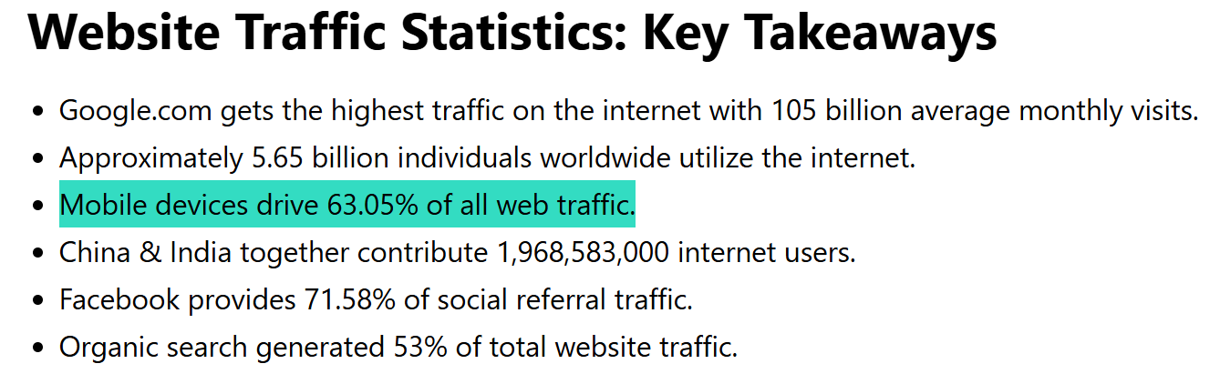
More than half of global web traffic now comes from mobile devices, and for a lot of local NZ businesses — someone Googling “plumber near me” on the couch — it’s higher still. If your menu is a pain on a phone, you’re failing the majority of your audience.
The hamburger menu (those three little lines) is the standard mobile pattern, and it’s fine — but it has a real cost worth knowing. Tucking your navigation behind an icon makes it harder to notice.
Nielsen Norman Group found that hiding the main navigation cuts its discoverability almost in half. In their mobile testing, the site with the most prominent navigation got used by 89% of people, versus 44% on one where it was easy to miss.

None of this means you should ditch the hamburger — it’s a perfectly good pattern on a small screen.
The real lesson is simpler: don’t bury the links that drive your business. Keep your key action — Call, Book, Get a Quote — visible on mobile even when the rest sits behind the icon.
A few mobile rules that matter: make tap targets big enough for a thumb, make sure dropdowns actually open cleanly on touch (a hover menu that needs a mouse is broken on a phone), and put your most-tapped links where a thumb naturally lands.
Add structure once your site gets bigger
Once you’ve got more than a handful of pages, you need structure — sensible dropdowns or a mega menu, breadcrumbs on deeper pages, and a search bar on content-heavy sites.
Without it, the menu turns into a junk drawer.
Hierarchy is the idea here. Group related pages under clear parents so people drill down logically: a category, then a sub-category, then the page.
A rough guideline you’ll hear is the “three-click rule” — nothing should be more than three clicks from the homepage.
Treat it as a nudge, not a law. What actually matters is that the path feels obvious, not that you’ve counted the clicks.
For bigger or more complex menus, a dropdown handles a few sub-items and a mega menu handles a lot — think an online store with many product categories laid out in columns.
Breadcrumbs earn their keep on deep sites. That little “Home > Services > Bathroom Renovations” trail shows people exactly where they are and gives them a one-tap way back up. On an ecommerce site especially, they’re close to essential.

A search bar matters more than people think on content-heavy or product-heavy sites.
Baymard’s ecommerce research found that roughly half of users reach for search as their preferred way to find a product, while the other half browse the navigation. Serve only one of those groups and you frustrate the other half.
I looked at a Christchurch online store recently with no breadcrumbs and no search — just a flat list of categories. Customers were landing three levels deep with no easy way back and no way to jump straight to what they wanted.
Adding both was a quick fix that made the whole site feel navigable. Sorting out that kind of structure is often the unglamorous core of SEO in Christchurch for any store with real depth to it, because it also shapes how cleanly Google can crawl the site — which ties straight into the technical side of SEO.
Turn your footer into a second navigation
Treat your footer as secondary navigation: the place for the useful links that don’t earn a spot in your main menu.
People scroll to the footer on purpose. It’s where they expect to find the supporting stuff — an About page, contact details, your main service or location links, privacy and terms.
It’s prime real estate for everything that’s genuinely useful but doesn’t deserve top billing.
The trap is overstuffing it. A footer crammed with forty links to every page on the site stops being navigation and starts being noise.
Keep it to the links people actually look for down there, organised into a few clear groups.
Make your navigation accessible
Accessible navigation helps visitors with impairments use your site — and it helps Google read your menu too. The two goals line up neatly.
A few things to get right: use strong colour contrast so menu text is easy to read; use real text for your links rather than text baked into an image (a screen reader can’t read an image, and neither can a search engine); and make sure the menu can be operated with a keyboard, not just a mouse.
That last pair is the quiet SEO angle. What a screen reader needs to understand your navigation — clear, real, structured text links — is almost exactly what a search crawler needs.
Build your menu in clean text and you’ve helped both at once. Bury it in an image or a script Google can’t follow and you’ve hidden it from everyone who matters.
How your navigation shapes what ranks on Google
Your navigation is the most powerful internal linking on your site, so it directly controls which pages Google finds, how authority flows to them, and what it thinks matters most.
This is the part the UX guides skip — and it’s where an SEO company earns its keep.
Three things are happening under the hood.
Discovery and crawl depth. Google finds your pages by following links, and your menu is the biggest, most consistent set of links you’ve got.
A page reachable from the main navigation gets found and crawled easily. A page with no menu path — an orphan — can sit there for months, invisible to search engines no matter how good it is.
Authority flow. Your homepage is usually your strongest page, and it passes authority through every link on it. The pages in your main menu sit one step from the homepage and drink from that well first.
Put your money pages in the navigation and they inherit that strength; bury them five clicks deep and they get the dregs.
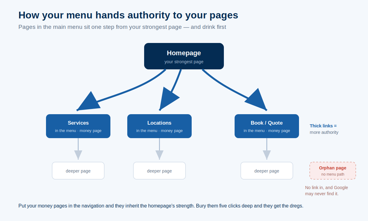
Priority signals. What you choose to feature in your main navigation tells Google what you consider important. Your menu is, in effect, you telling the search engine which pages are your priorities.
This is why the menu-trimming and clear-labelling from earlier do double duty: they tidy the experience for visitors and they feed more organic traffic by concentrating authority where it counts.
It’s the same principle behind the old line that if you halve the number of links on your homepage, you roughly double the authority passed to each one. Less spray, more focus.
Get your navigation right and you’ve done a chunk of your SEO without writing a single new page.
How navigation should differ for your type of site
The right navigation depends on what your site is actually for. A service business, an online store, and a content site each need a different shape.
A service or local business site should be lead-focused. A short menu, your core services up top, and your booking or quote page impossible to miss.
Don’t make someone hunt for the thing that makes you money. An Auckland tradie’s site needs maybe five items and a fat “Get a Quote” button — that’s it.
Keeping it that lean is part of what makes SEO for Auckland businesses work in the most competitive market in the country: clarity beats clutter.
An ecommerce store needs the full toolkit — categories and sub-categories, filtering, breadcrumbs, and a proper search bar. People shop differently, and your navigation has to support both the browsers and the searchers.
A blog or content site lives or dies on topic structure and search. Group content by theme, make search easy to find, and link related articles so people keep reading.
A small one-page site can use anchor navigation — menu links that jump to sections down the page. Done well it’s smooth; just make sure each section is clearly labelled so people don’t lose their place.
The navigation mistakes that quietly cost NZ businesses leads
A handful of navigation mistakes show up again and again on NZ business sites, and each one costs leads or rankings. Most aren’t dramatic — they’re just overlooked.
Burying your most important page. I’ve seen an Auckland dental practice put its “Book Online” page three clicks deep behind a generic menu.
The single most valuable action on the whole site, hidden. If a page makes you money, it goes in the main navigation.
Orphan pages with no menu path. A page that nothing links to is invisible — to visitors who can’t find it and to Google, which struggles to crawl it. Every important page needs a route in.
A builder’s quote page with no link from the menu is a lead form nobody can reach, which undercuts the whole point of doing SEO for builders in the first place.
Mystery-meat navigation. Icon-only menus with no labels, or clever names nobody understands. If people have to hover and guess, you’ve already lost some of them.
Changing the menu between pages. Inconsistent navigation makes people feel lost even when they can’t pinpoint why. Same menu, everywhere.
The everything-in-the-footer dump. Forty links crammed down the bottom stops being helpful and turns into wallpaper.
Most of these are easy to spot once you go looking. If you want them found and prioritised for you, a proper SEO audit will surface the structural problems that are holding your site back — the orphan pages, the buried money pages, the crawl dead-ends.
Should you fix your navigation yourself or get help?
Most navigation fixes are well within reach if you’ve got a spare afternoon. Some are bigger jobs where it pays to bring someone in. Knowing the difference saves you both time and money.
You can absolutely do the basics yourself today. Trim the menu down to what matters. Rename vague labels in plain language.
Reorder things so your money pages sit up front. Push the clutter to the footer. None of that needs a developer — most of it is a few clicks in WordPress, Wix, or Shopify.
Where it gets trickier is when navigation tangles up with site structure and rankings: planning a logical hierarchy for a big site, fixing orphan pages, restructuring how authority flows, or untangling a menu that’s grown wild over years.
That’s where a bit of professional SEO help saves you from guessing — and if the problems run deep enough that you’re weighing up a full rebuild, you’re into website design territory rather than a quick menu tidy.
And if you’d rather have someone map the whole thing out with you before you touch anything, that’s exactly the kind of work SEO consulting is for — a clear plan, then you decide what to do with it.