
Picture a business owner who just dropped a few grand on a brand-new website.
It looks the part. Clean design, sharp photos, smooth little animations. They’re proud of it, and fair enough — it’s a good-looking site.
Then a month goes by. The site’s getting visitors. And the phone still isn’t ringing.
That gap — between a website that looks good and a website that actually brings in work — is the whole game. Plenty of sites are built to earn a compliment. Far fewer are built to earn a customer.
So this is a straight breakdown of what makes a website convert: what counts as a good conversion rate in real numbers, the specific things that turn a visitor into an enquiry, and how to spot what’s quietly leaking sales on your own site right now.
What Is a High Converting Website?
A high-converting website is one that turns a high share of its visitors into a specific action you care about — an enquiry, a phone call, a booking, a quote request, or a sale.
The key word there is action. A website is a tool with a job: get the visitor to do the one thing that matters to your business — not a brochure you leave lying around hoping someone reads it.
And that thing changes depending on what you do. A café counts a table booking as the win. A builder counts a quote request. A SaaS product counts a free-trial signup. Same idea, different finish line.
Here’s the part most people miss: “high-converting” is relative. There’s no universal number that makes a site good or bad.
A site converts well when it beats the average for its goal — and to know whether yours does, you need to know what the averages actually are.
What’s Actually a Good Conversion Rate?
Around 2–3% is where most websites land. Anything north of 5% is genuinely good, and the right target depends entirely on what you’re asking people to do.
Let’s put real numbers on it, because this is where most guides go quiet.
The overall average across industries sits at about 2.35%. That means for every 100 people who land on a typical site, fewer than three do anything at all. The other 97 just leave.
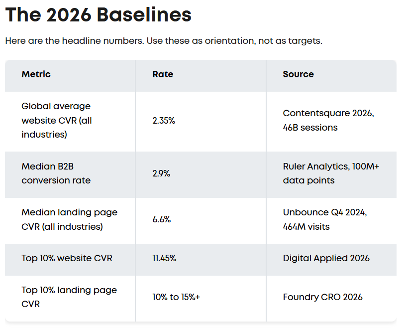
But the all-industries average is close to useless on its own.
Dig into a study of 14 industries and the average lands near 2.9%, with finance sites pushing past 11%. Legal services benchmark around 7.4%. The point: a 3% rate could be excellent for one business and a quiet disaster for another.
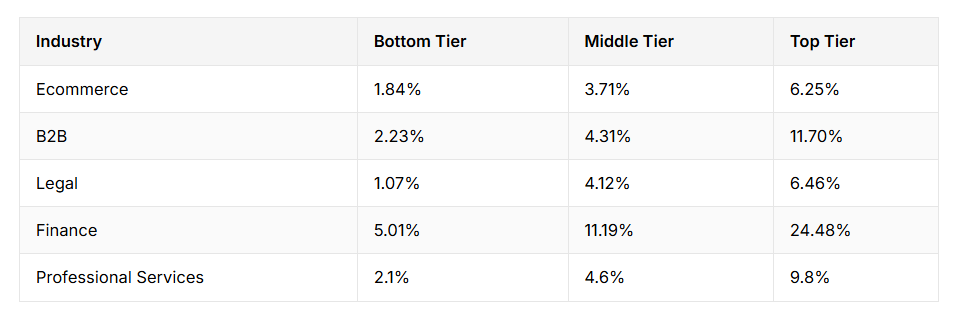
What matters more is the goal, not the industry.
For a typical NZ service business, realistic benchmarks look like this: around 3% on a contact form, 5% or more on a quote-request page, and 8–10% on a focused landing page tied to one offer.
So if someone asks “is 3% good?” — the honest answer is: it depends what you’re measuring.
A mortgage broker counts a booked call as the win, not a newsletter signup, and getting those calls is exactly what SEO for mortgage brokers is built around. A 3% rate on that call-booking page is solid. The same 3% on a low-stakes email signup is poor.
The takeaway is simple: don’t chase one magic number. Know what action you’re tracking, find the benchmark for that action, and aim to beat it.
Why Most Websites Look Great but Don’t Convert
The reason most good-looking websites don’t convert is simple: they were built to look good, not to sell — and looking good and selling are two completely different skills.
Here’s the thing nobody in the web design world likes to say out loud: a designer and a salesperson optimise for different things.
A designer optimises for how it looks. Balance, whitespace, typography, a portfolio piece they’re proud to show off. All good things. But none of that is the same as convincing a stranger to pick up the phone.
A salesperson optimises for the next action. They think about what the visitor is worried about, what question is stopping them, and what one step to put in front of them next.
They’ve sat across from real customers and watched people hesitate, so they build the page around removing that hesitation.
A gorgeous site with no selling logic is an expensive brochure. It wins compliments and loses customers.
The rare combination — and the reason this matters — is someone who can do both: make it look sharp and make it sell. That’s the difference between web design services built by someone who only thinks about pixels, and ones built by someone who understands how a sale actually happens.
For the decade I’ve been doing SEO, the sites that print leads have almost always been the ones designed by someone who thinks like a salesperson first and a designer second.
The Things That Actually Make a Website Convert
A website converts when it makes one thing instantly clear — what you do, who it’s for, and the next step — then strips away every reason not to take it.
Let’s break down the elements that actually move the needle.
A headline that says what you do, in seconds
The moment someone lands on your page, they’re asking three silent questions: what is this, is it for me, and what do I do next? You’ve got a few seconds to answer all three. This is the “above the fold” zone — everything visible before they scroll.
A strong headline plus one supporting line usually does it. “Roof repairs and re-roofing for Waikato homes — free quotes within 48 hours” tells a visitor exactly where they are and what happens next.
Vague taglines like “Quality you can trust” tell them nothing.
One obvious next step
Every page should have a single primary action you want the visitor to take, repeated as they scroll.
One clear button — “Get a free quote”, “Book a call” — beats five competing buttons every time. When you give people five choices, a lot of them choose nothing.
Copy written like a salesperson, not a brochure
This is where conversion lives or dies. Brochure copy talks about the business (“We are a family-owned company committed to excellence”).
Sales copy talks about the customer’s problem and how you solve it. Good SEO copywriting does both jobs at once — it speaks to the buyer and gets the page found in the first place.
Proof you can be trusted
People don’t buy from sites they don’t trust, and online they can’t read the room — so they look for signals. Reviews, testimonials, real results, recognisable logos.
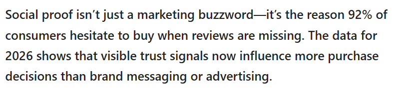
It works: around 92% of consumers hesitate to buy when reviews are missing. For a dental practice, a wall of genuine patient reviews does more for bookings than any design flourish, which is why trust signals sit at the centre of SEO for dentists too.
Speed
A slow site loses people before they read a single word. The numbers are brutal: a one-second delay can cut conversions by up to 20%. Every extra second of load time is people quietly closing the tab.

Works properly on a phone
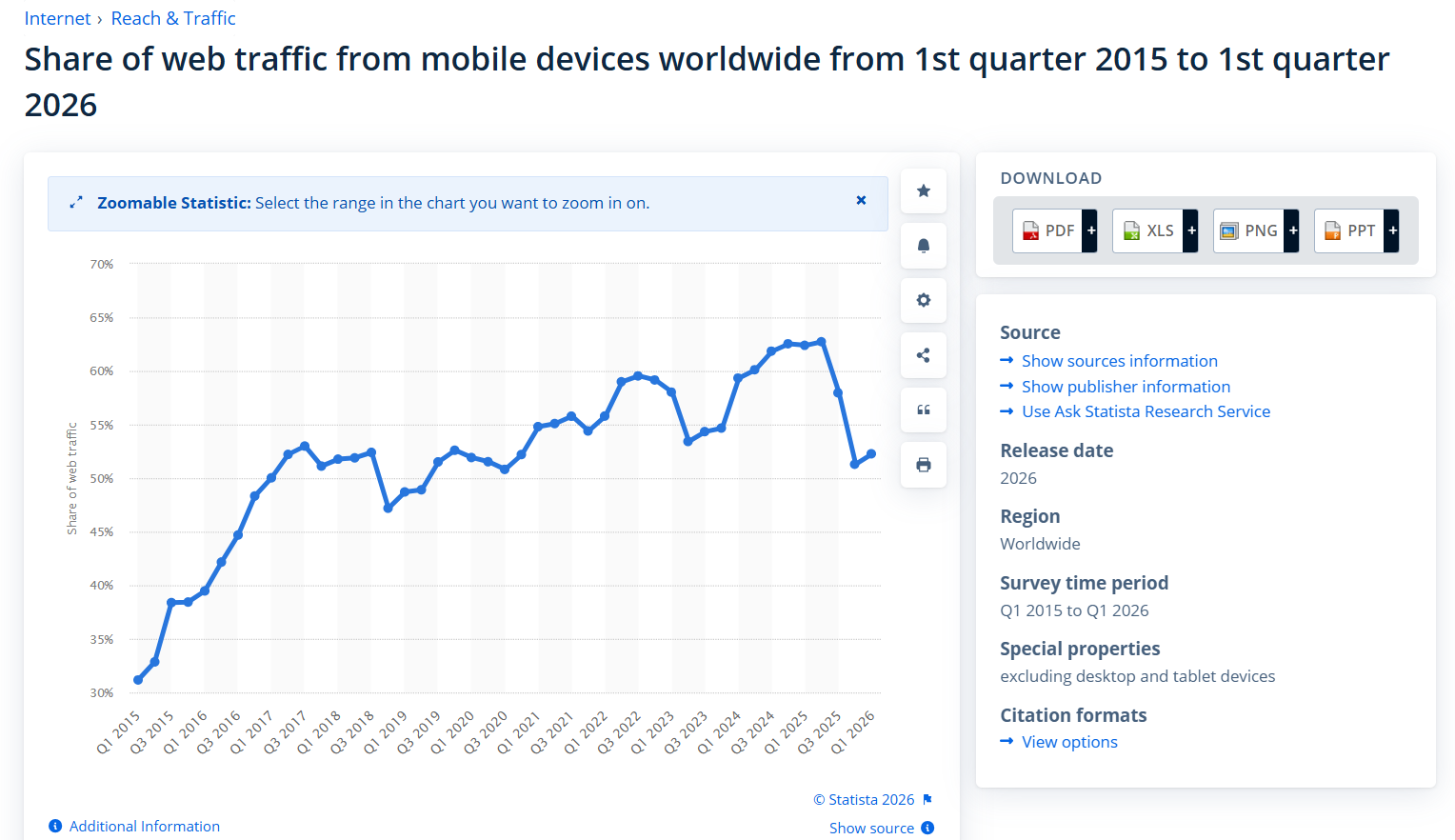
More than 62% of web traffic is now mobile, so if your site is awkward on a phone — tiny tap targets, a form that’s a nightmare to fill in, text you have to pinch to read — you’re losing the majority of your visitors.
Build for the phone first, then make sure it still looks great on desktop.
A clear path with no dead ends
Short forms (only ask for what you actually need), obvious navigation, and no point where the visitor gets stuck wondering what to do. Every extra step is a chance for someone to give up.
To see how this comes together: imagine a building company in Hamilton with a tidy site that loads fast, opens with “Renovations and new builds across the Waikato — book a free site visit”, and shows fifteen real project photos with genuine reviews underneath.
That page will out-convert a flashier competitor every time. The catch is it still has to be found — a perfectly converting page nobody visits earns nothing, which is where SEO in Hamilton does the other half of the job.
How to Spot What’s Killing Conversions on Your Own Site
You can find most conversion leaks in about 15 minutes by looking at your own site the way a cold visitor would — not the way the proud owner does.
Here’s a quick self-audit anyone can run today.
Start with the 5-second test. Open your homepage, count to five, then look away. Could a total stranger tell what you do, who it’s for, and what to do next? If you had to think about it, your visitors are bouncing.
Look at where people drop off. You don’t need to be an analytics wizard. Open Google Analytics and look at two things: which pages people land on, and which pages they leave from. If everyone’s bailing on the same page before they convert, that page is your problem.
Check the usual culprits. In my experience auditing NZ small-business sites, the same handful of leaks show up again and again: a vague headline that doesn’t say what you do, a phone number buried in the footer instead of up top, zero proof or reviews, and a slow load time.
Take a financial adviser’s site that’s getting decent traffic but no enquiries — nine times out of ten it’s one of those four, and fixing them is what turns the same traffic into actual calls. (It’s also the bread and butter of SEO for financial advisers — relevance and trust, not flashy design.)
If you’d rather not eyeball it yourself, a proper free website audit will surface the technical and on-page issues holding the site back, conversion leaks included.
Traffic and Conversion: Why One Without the Other Is Useless
A converting website with no traffic is invisible. Traffic with no conversion is wasted money. You need both — and most businesses obsess over one and ignore the other.
Think of it as two halves of the same machine. The first half is getting found: people have to actually arrive, which is what SEO and search visibility do. The second half is conversion: turning those arrivals into action once they land.
Here’s the part that surprises people. Fixing conversion is often cheaper and faster than chasing more traffic.
If you’re already getting 1,000 visitors a month and converting 1%, doubling that to 2% gets you the same result as doubling your traffic — without spending a cent more on getting found.
A lot of businesses jump straight to “I need more visitors” when the bigger, quicker win is sitting in the visitors they already have.
But long-term, you want both pulling together. Getting found in a competitive market like SEO in Auckland is a different challenge than a small town — more competition for attention means the converting half has to work even harder.
This is the whole reason our SEO company works on both sides instead of just one.
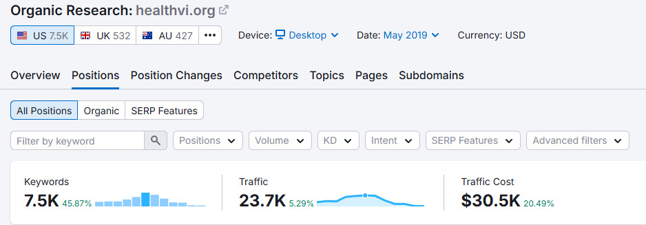
Back in 2017 I started a project with my former business partner and SEO mentor, Ian Pribyl — a health website, HealthVI — and grew it from zero to over 20,000 monthly visitors.
None of that traffic would have mattered if the pages didn’t turn readers into action. Getting found and converting are the same job done in two steps; the HealthVI results came from doing both, not picking one.
How to Lift Your Conversion Rate Over Time
You raise a conversion rate by changing one thing, measuring it, keeping what wins, and repeating — not by redesigning the whole site on a hunch.
This is A/B testing, and it’s simpler than it sounds. You run two versions of a page (or just one element) and see which one converts better. The rule is to test one thing at a time, or you’ll never know what actually made the difference.
Start small and obvious. Change your main button from “Submit” to “Get my free quote” and watch what happens.
Test “Book a viewing” against “Check availability”. Try a different headline. These tiny tweaks regularly shift lead volume in ways that look almost too small to matter.
And test on your highest-traffic page first, not the whole site. The page that already gets the most visitors is where a small percentage lift turns into the most extra enquiries. Fix the biggest leak first, then move down the list.
Do It Yourself, or Bring In Someone Who Knows Sales?
You can build a converting site yourself if you genuinely understand your buyer and you’ve got the time — but if your website is a real source of leads, getting someone who blends design and sales usually pays for itself fast.
DIY makes sense when you’re early-stage, the stakes are low, and you know your customer well enough to write copy that speaks to them. Plenty of great-converting sites started exactly this way.
It’s worth bringing someone in when the site genuinely drives revenue, when you’re guessing instead of knowing, or — the classic one — when you’ve had it “redone” twice and it still doesn’t bring in work.
That’s almost never a design problem. It’s a sales problem wearing a design costume.
When you do hire, look past the portfolio of pretty sites. Ask how they think about the visitor’s next action, what they’d put above the fold and why, how they’d prove trust.
The answers tell you fast whether you’re getting a decorator or someone who understands selling.
If you’d rather hand the whole thing over, that’s the gap professional SEO help is meant to fill — and if you just want a second set of eyes on what’s broken, you can work with an SEO consultant without committing to a full rebuild.
A website that sells comes from someone who understands selling. If you’d rather have yours built to bring in work from day one, that’s where we come in.