

Every “best website design” list shows you the same five sites — Apple, Stripe, Airbnb, the usual Silicon Valley giants with design teams bigger than most Kiwi companies.
It’s pretty to look at. It’s also useless to you.
You can’t take a billion-dollar design budget and bolt it onto a Hamilton trades business or a Wellington consultancy.
What you can do is look at New Zealand businesses that nailed their website on a real budget, and copy exactly what they did.
So that’s what this is: ten of the best-designed websites in NZ, what each one gets right, and the specific moves you can steal for your own site.
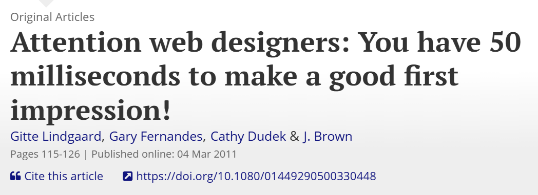
A quick note on why this matters before we dive in. People form an opinion about your website in about 50 milliseconds — faster than a blink.
That first split-second decides whether they stay or bounce. Good design is what wins that moment.
How We Chose These Best Website Design Examples
A good website design is the one that loads fast, makes what you do obvious in seconds, earns trust, and nudges the visitor toward the next step. Looking impressive is a bonus, not the goal.
That’s worth sitting with, because most people get it backwards. They chase the slick animation and the moody hero image, then wonder why the leads don’t come.
A website’s job is to turn a stranger into an enquiry. Everything else serves that, or it’s in the way.
Here’s the lens I judge every site on, and the same one you should use on your own:
Clarity. Within a few seconds, can a visitor tell what you do, who it’s for, and what to do next? If they have to work it out, you’ve already lost some of them.
Trust. Does it look like a real, capable business? That impression does real work — around 75% of people judge a company’s credibility on its website design alone, according to Stanford’s web credibility research.
A dated, clunky site quietly tells people you might be dated and clunky too.

Speed. A beautiful site that takes six seconds to load isn’t beautiful to the person staring at a blank screen. Fast is a feature.
Mobile. The phone is where most people will actually see your site, so the phone view is the main view, not an afterthought.
A clear next step. One obvious thing you want the visitor to do, made easy to find.
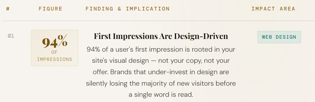
Get those five right and you’re ahead of most NZ business sites already. And it pays off where it counts: 94% of first impressions are design-related, so design is the fastest sales pitch your business will ever make, before a single word gets read.
The 10 Best New Zealand Website Design Examples
I’ve grouped these by business type so you can skip to the one that looks like yours. For each, you get what they do, what makes the design work, and the one thing to steal.
Tech, SaaS and Fintech
1. Xero
Xero sells something genuinely complicated — accounting software — and somehow the site never feels heavy.
Loads of white space, plain-English headlines, and a calm, confident layout that walks you through a complex product without making you feel stupid.
The design does the hard work of simplification. Nothing fights for your attention, so the one message in front of you actually lands.
Steal this: clarity beats cleverness. If your product is complex, let the design breathe and say one thing at a time.

2. Sharesies
Investing scares a lot of people off. Sharesies built a website that does the opposite — bright, friendly, rounded, approachable, with copy that talks like a human instead of a fund manager. The design lowers the barrier before you’ve signed up to anything.
And that tone goes deeper than the copy. It’s in the colours, the shapes, the imagery — the whole thing feels like it’s on your side.
Steal this: design carries tone. If your industry feels intimidating, use friendly visuals to disarm it.

3. Hnry
Hnry handles tax and admin for sole traders, and the site leads with the outcome, not the features.
The headlines are about what you get — less admin, only pay when you get paid — front and centre. You understand the offer in seconds.
It’s a masterclass in benefit-led design: the page is built around the problem it solves, not the mechanics of how.
Steal this: lead with the result your customer wants, not a list of what your product does.

Retail and Marketplace
4. PB Tech
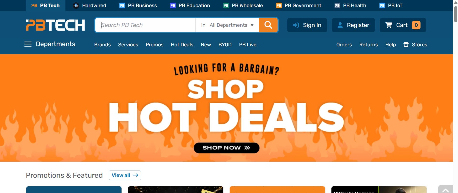
PB Tech is the opposite of minimalist, and that’s exactly right for them. Thousands of products, deals everywhere, and yet you can still find what you came for.
Strong search, sane categories, and a layout that handles density without becoming chaos.
When you sell a huge range, structure matters more than empty space. PB Tech proves a busy site can still be a usable one.
Steal this: if you’ve got a lot to show, invest in navigation and search before you worry about looking sparse.
5. Trade Me
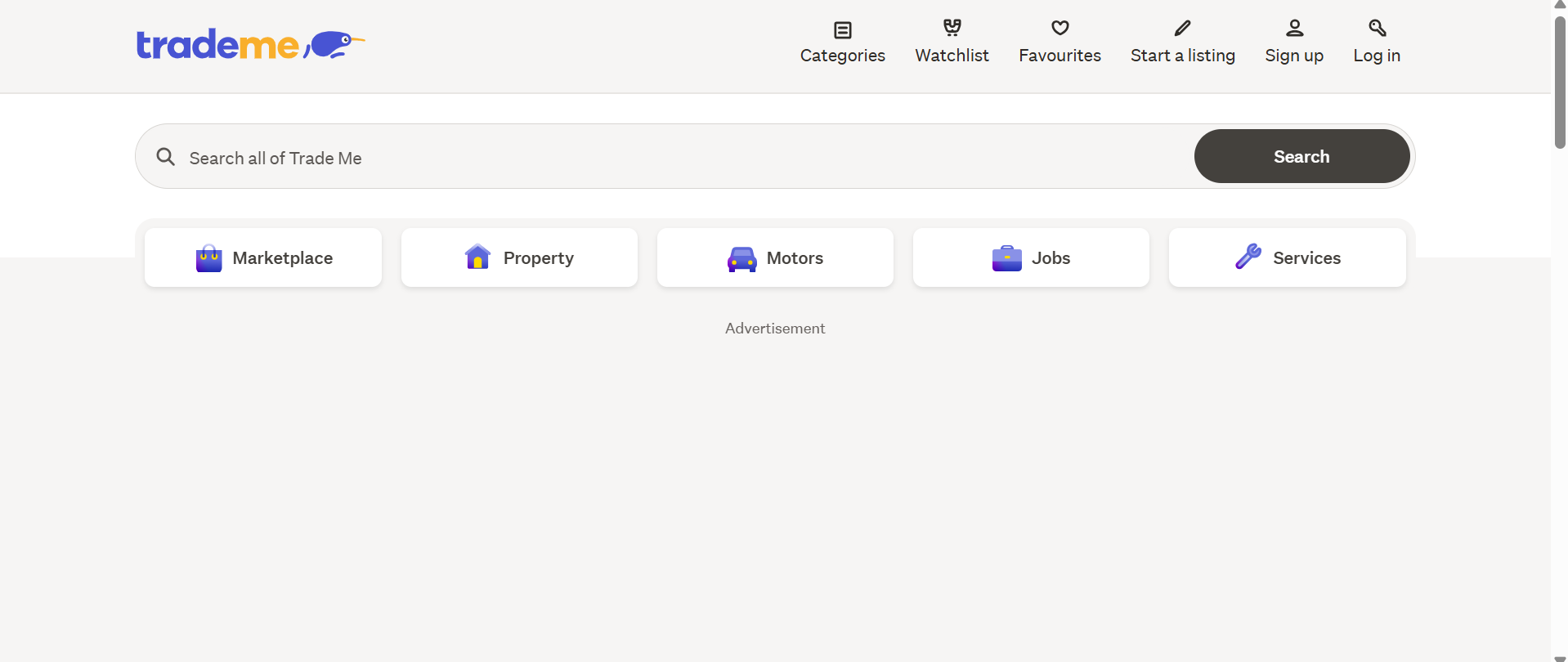
Trade Me is a New Zealand institution, and its design knows it. It’s familiar, fast, and ruthlessly functional rather than trendy — and that’s the point. Millions of Kiwis know exactly how to use it because it never reinvents itself for the sake of looking modern.
There’s a lesson in restraint here. Sometimes the most valuable thing a design can do is not confuse the people who already trust it.
Steal this: usability and familiarity beat trendy. Don’t redesign away the things people already know how to use.
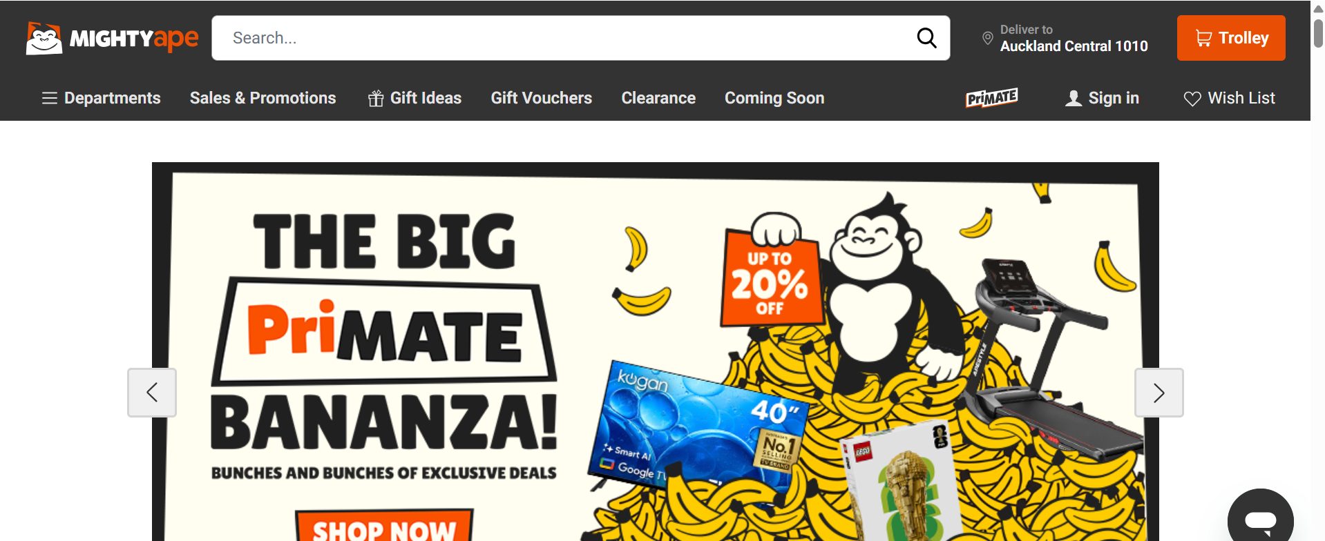
6. Mighty Ape
Mighty Ape sells games, books and gadgets — stuff you could buy anywhere — so it competes on personality.
The brand voice is fun and unmistakably Kiwi, and it shows up everywhere: the copy, the little touches, the tone. Slick ecommerce UX wrapped in a brand that actually has a character.
In a commodity market, that personality is the differentiator. The checkout’s smooth, but it’s the voice that makes you remember them.
Steal this: when you sell the same thing as everyone else, let your design and voice carry the personality.
Brand and Storytelling
7. Allbirds
Allbirds is NZ-founded and genuinely world-class. The design is all restraint — the product is the hero, the photography does the talking, and the sustainability story sits quietly underneath without shouting.
Almost nothing on the page is wasted.
It’s the discipline most sites lack: the confidence to say less. Every element that’s there has earned its place.
Steal this: cut until only what matters is left. Show the product, tell the story, drop the clutter.

8. Icebreaker
Icebreaker leans hard into where it comes from — New Zealand merino, the high country, the origin of the product — and the design tells that story with immersive imagery and a clear sense of identity.
You don’t just see the gear; you feel the place it came from.
That provenance is the moat. Anyone can sell a wool jumper, but the story is theirs alone, and the design makes it the centrepiece.
Steal this: lead with what’s genuinely different about you. For a lot of NZ businesses, that’s the local story.

9. Rocket Lab
Aerospace could be the driest website on earth. Rocket Lab’s is the opposite — bold, dark, cinematic, genuinely thrilling.
It proves a “serious” industry doesn’t have to mean a boring site.
This is the one to look at if you think your trade is too dull for good design. Rocket Lab launches rockets and still found a way to make the website feel like an event.
Steal this: no industry is too boring for great design. If they can make aerospace look exciting, you’ve got no excuse.

Service Business
10. Expert SEO
The most relatable example for most readers, because most Kiwi businesses sell a service, not a product.
A service site has a harder job: no product photos to lean on, so it has to win on trust, clarity, and proof.
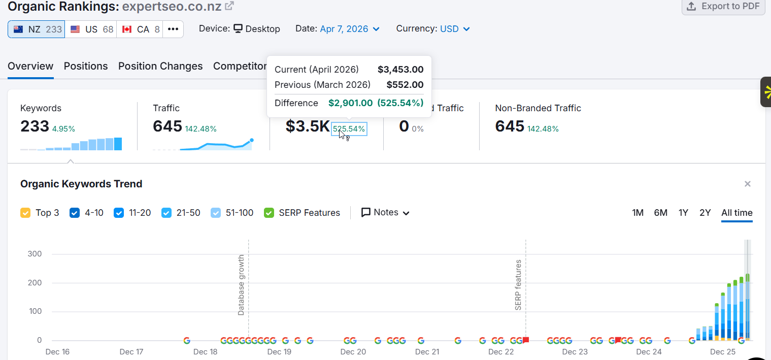
Ours leads with results and a clear offer, loads fast, and is built to be found as well as admired (and yes, that’s our own site on the list — I’d be a hypocrite preaching design and findability while hiding mine).
The proof is in the numbers: our SEO company is just over a year old and already outranking NZ agencies with a decade’s head start, pulling organic traffic worth around $3,500 a month and getting cited in Google’s AI Overviews.
Steal this: a service site wins on trust and clarity. Put your proof up front and make the next step obvious.
The Patterns Behind Every Great NZ Website
Look across all ten and the same handful of moves keep showing up. None of them need a big budget — they need discipline.
One clear message above the fold. The moment the page loads, you know what the business does and who it’s for. No hunting.
Generous white space. Room to breathe makes a page feel calm, premium, and easy to scan. Cramming everything in does the opposite.
Fast load times. Every one of these sites is quick. They know a slow page is a closed shop with the lights off — people assume you’re shut and walk on.
An obvious next step. One clear call to action, easy to find, repeated where it makes sense. The visitor never has to wonder what to do.
Real trust signals. Reviews, recognisable logos, genuine photography, results. Proof that a real, capable business sits behind the screen.
Built mobile-first. They look as good on a phone as on a laptop, because that’s where most people actually are.
The best NZ sites don’t out-spend everyone. They out-clarify them.
The Website Design Mistakes That Sink Most NZ Business Sites
New Zealand business websites tend to fail for the same few reasons, and every one of them is fixable.
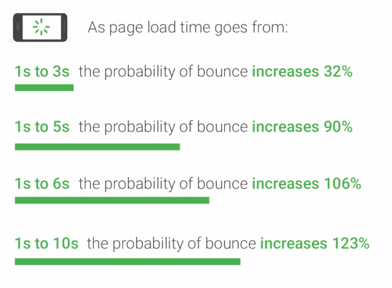
They’re too slow. Speed is the silent killer. As load time goes from one second to three, the probability of a bounce jumps 32%, per Google’s own research.
Picture a Hamilton tradie who finally gets web design in Hamilton sorted, only for the site to crawl because it’s stuffed with giant unoptimised images.
All that effort, undone by load time. Fix: compress images, cut bloated plugins, and pick decent hosting.
The message isn’t clear. Land on the homepage and you can’t tell what the business does. Vague taglines, clever copy that says nothing. Fix: one plain sentence, above the fold, on what you do and who it’s for.
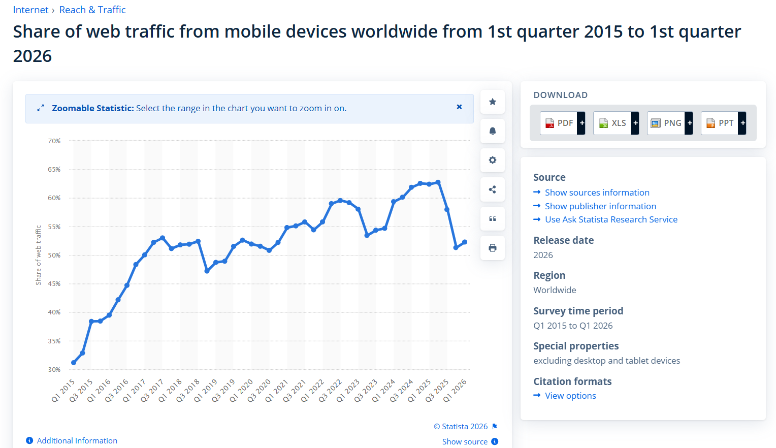
Mobile is an afterthought. With around 57% of NZ web traffic coming from phones, a site that only looks right on a desktop is broken for most of its visitors. Fix: test every page on a phone before it goes live, and design for that screen first.
There’s no clear next step. A nice-looking site with no obvious call to action just lets warm visitors wander off.
An Auckland business paying for a beautiful redesign still loses leads if there’s nowhere obvious to click. Good Auckland web design always points the visitor somewhere. Fix: decide the one action you want, then make it impossible to miss.
It looks cheap. Stock photos, clashing fonts, a logo stretched out of shape. It quietly tells people you don’t sweat the details. Fix: consistent fonts and colours, real photography, and breathing room.
A Beautiful Website No One Can Find Is Worthless
Here’s the part the design galleries never mention: a gorgeous site that doesn’t get found is a very expensive piece of art no one visits.
Design and findability are the same job. The best NZ sites are built so Google can read them and humans want to use them, because a website that no one lands on can’t convert anyone.
I’ve seen plenty of stunning sites flop on this — usually the prettiest ones, built by designers who never thought about search.
The good news is the things that make a site good for people often make it good for Google too.
Clean structure, fast load, clear content, a solid mobile experience — those feed straight into optimising your pages for search, and they sit on top of the technical side of SEO that decides whether Google can crawl you at all.
Think of a law firm with a beautiful, expensive new website sitting on page four of Google. It looks the part and nobody ever sees it.
That’s where SEO for lawyers — and findability for any business — has to be designed in from the start, not bolted on later. Design gets the visitor to act; SEO is how the visitor arrives in the first place. You need both to grow your traffic into actual enquiries.
A great site doesn’t just look good; it gets found, and it turns the people who find it into customers.
How to Get a Website Like These (DIY vs Hire)
You don’t need a Rocket Lab budget to get most of what makes these sites work. The real question is whether you’ve got the time and skill to do it yourself, or whether you’re better off handing it over.
Doing it yourself. Modern platforms get you a long way. A good template on Squarespace, Wix, Shopify or WordPress, plus the patterns above — clear message, white space, fast load, one obvious call to action — will beat the majority of NZ business sites.
Faster sites convert better, too: a site that loads in one second can convert several times higher than one that crawls, so don’t treat speed as optional. DIY works best when your needs are simple and you’ve got the hours to learn.

Hiring help. Once the site has to do real work — handle a big product range, integrate booking or payments, or rank against serious competitors — the time you’d sink into learning is usually worth more than the fee.
That’s the moment to bring in our web design service and get it built properly.
If you’ve already got a site that isn’t pulling its weight, start by finding out what’s actually wrong with it. An SEO audit will show you where the design, speed and findability are leaking visitors before you spend a cent on a rebuild.
And if you’d rather skip the learning curve entirely, professional SEO help takes the whole thing off your plate.
Whatever you choose, the goal’s the same: a site that’s clear, fast, trustworthy, and easy to find. That’s not a budget thing. That’s a discipline thing.