

I had a client once who spent $10,000 on her website.
Branding, custom illustrations, a logo that came in three different colourways — the lot. It looked stunning. The kind of site that gets a quiet “ooh” when it loads.
And it did almost nothing for her business.
No extra enquiries, no real lift in sales — just a beautiful brochure sitting in a corner of the internet nobody ever wandered into.
I’ve always thought the same money spent on getting her found would have paid for itself ten times over (and I told her as much, gently).
Here’s the thing that story teaches, and it’s the lens for everything below: a great-looking website and a website that makes money are not the same thing.
The principles of web design are the rules that decide which one you end up with.
Get them right and a visitor glides from “who are these people?” to “how do I book?” without ever noticing the work that went into it. Get them wrong and even a gorgeous site leaks customers.
So let’s go through the recognised principles of good web design — explained the way they actually matter to a business — plus the one principle the design blogs almost always leave out.
What Are the Principles of Web Design?
The principles of web design are the core rules that make a website clear, easy to use, and effective — covering purpose, simplicity, visual hierarchy, navigation, consistency, readability, and mobile responsiveness.
That’s the textbook answer. Here’s the practitioner one: every principle is just a way of removing friction between a visitor and the thing you want them to do.
Quick clarification, because these terms get tangled. Web design is the whole craft of planning and building how a website looks and works.
Within that, the elements of a website — layout, colour, typography, imagery, buttons, white space — are the raw materials, while the principles are the rules for arranging those materials so the thing actually works.
Elements are the what; principles are the how.
Notice what’s not on that list. “Looks amazing” isn’t a principle. Neither is “on-trend” or “award-worthy.”
When we talk about professional website design, we’re not talking about decoration — we’re talking about a set of decisions, each one earning its place by making it easier for a real person to read, understand, trust, and act.
Keep that in your head as we go. Every principle below answers one question: does this help the visitor take the next step, or does it just look nice?
The 7 Principles of Good Web Design
There are dozens of design “rules” floating around — some lists run to twenty. Most of those are sub-points dressed up as principles. Strip it back and seven do the heavy lifting. Nail these and you’ve got a site that works.
1. Clarity of Purpose: One Page, One Job
Every page should have one clear job, and one main action you want the visitor to take.
This is the principle everything else hangs off. Before you pick a colour or a font, you answer one question:
When someone lands here, what’s the single most important thing I want them to do? Call you. Request a quote. Book a table. Buy the thing.
Once you know that, the whole page bends towards it. The headline supports it. The button repeats it. Everything that doesn’t serve that one action is a candidate for the chopping block.
Picture a builder in Hamilton getting a new site built. His homepage doesn’t need a 600-word history of the company or a gallery of forty jobs. It needs one job: get a quote request.
A clear headline, three photos of real work, and a “Get a free quote” button that follows you down the page. That’s the call a good web designer in Hamilton makes on every build — decide the one action first, then design backwards from it.

When a page tries to do five things, it does none of them well. One page, one job.
2. Simplicity: When in Doubt, Take It Out
A simple website helps people act; a cluttered one overwhelms them into leaving.
Clutter is the silent killer. Every extra button, banner, pop-up and “while you’re here” box adds a tiny decision for the visitor to make — and decisions are tiring. Pile up enough of them and people do the easiest thing of all: they close the tab.
The research backs the gut feeling here. Roughly 38% of people stop engaging with a website when the layout is cluttered or unattractive. That’s nearly four in ten gone before they’ve read a word about how good you actually are.

Simplicity doesn’t mean plain. It means deliberate — every element on the page has to earn its spot.
White space, the empty room around your text and buttons, does real work here: it’s what makes the important stuff stand out. When you’re unsure whether an element earns its place, the answer is almost always to take it out.
3. Visual Hierarchy: Lead the Eye to the Money
Visual hierarchy is the order in which a visitor’s eye moves through a page — and good design points it straight at the action that matters.
People don’t read web pages; they scan them. Their eye lands on the biggest, boldest, brightest thing first, then works down. Visual hierarchy is you deciding, on purpose, what they see first, second and third.
Most design guides explain this as “guide the eye.” Fine — but guide it where? Towards the thing that makes you money. The biggest element on the page should be your main message.
The most obvious button should be your main action. If your “Contact us” link is the same size and colour as everything else, you’ve left it up to chance.
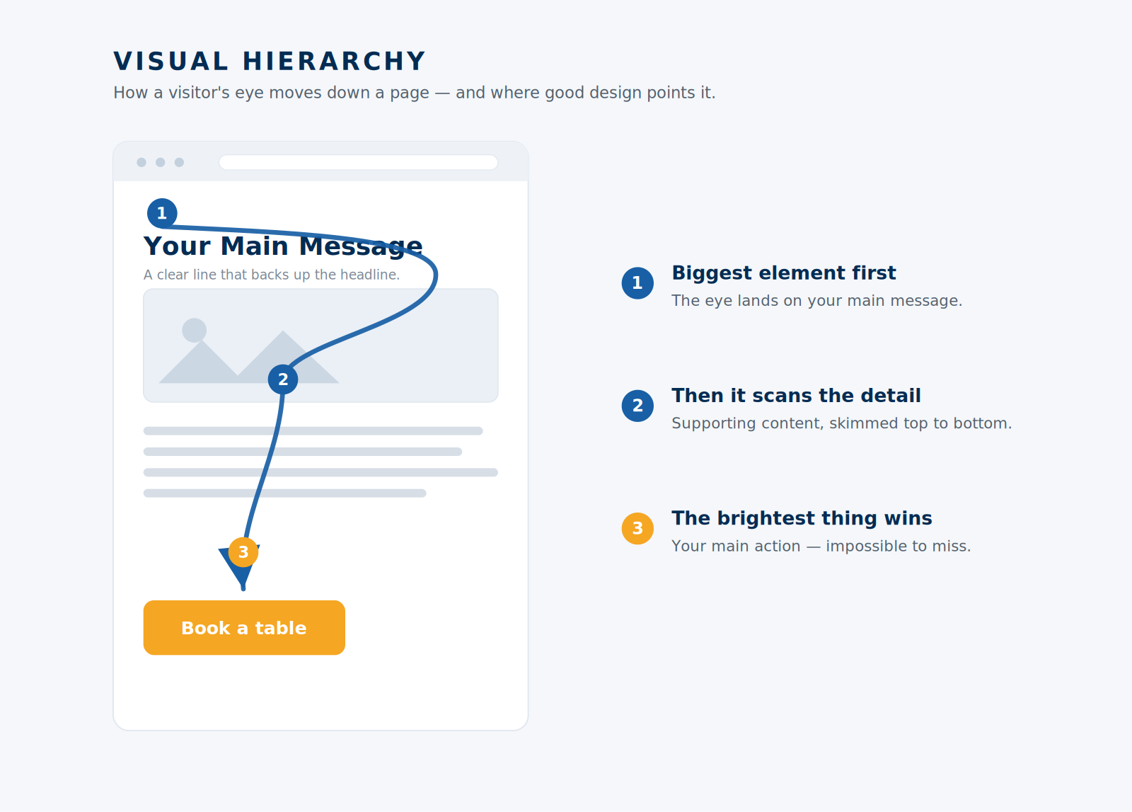
Think of an Auckland café getting a fresh site. The “Book a table” button should be the loudest thing on the screen — bigger, brighter, impossible to miss — because that’s the action that fills tables.
Good web design in Auckland doesn’t leave the booking button to fight for attention with the Instagram feed; it puts the money action front and centre.
4. Intuitive Navigation: Don’t Make People Think
Navigation should let visitors find what they came for in seconds, without thinking about how.
If someone has to hunt for your phone number, your prices, or how to get in touch, you’ve already lost a chunk of them. Good navigation feels invisible — people find things so easily they never notice the menu doing its job.
A few rules that almost never fail: keep the main menu short (five or six items, not fifteen), label things in plain language (“Pricing,” not “Investment”), and make sure your key action is reachable from anywhere on the site.
People read pages in predictable patterns — usually scanning the top, then down the left — so put your most important links where eyes already go, not buried in a footer.
The test is brutal and simple: can a stranger land on your site and find what they need in under five seconds? If not, the navigation is the problem — not them.
5. Consistency: Look Like You’ve Got It Together
Consistency means the same colours, fonts, spacing and button styles across every page — and it quietly builds trust.
When every page looks like it came from the same place, your business feels organised and reliable.
When the buttons change shape from one page to the next and the headings use three different fonts, it feels slapped together — and people transfer that feeling straight onto your service.
Pick a small set of colours and stick to them. Choose two fonts, maximum. Make every button behave the same way.
It sounds boring, and that’s exactly the point — predictability is what makes a site feel trustworthy. Consistency is the difference between looking like a real business and looking like a weekend project.
6. Readability: If They Can’t Read It, You’ve Lost Them
Readability is how easily someone can actually read your content — driven by font size, contrast, spacing and line length.
You can have the sharpest message in the world, but if it’s pale grey text on a white background in a tiny font, nobody’s reading it. And on a phone, the problem doubles.
The fixes are mostly mechanical. Use a font size big enough to read on a phone without pinching (16px and up for body text).
Keep strong contrast between text and background — dark text on light, or the reverse. Give your lines room to breathe with generous spacing, and don’t stretch them too wide.
Break walls of text into short paragraphs and use headings so people can scan.
Readability is the principle people feel without naming it. A page that’s easy on the eyes feels effortless; a hard-to-read one feels like work — and people don’t stick around to do work.
7. Mobile and Speed: Most of Your Visitors Are on a Phone
Your site has to look great and load fast on a phone, because that’s where most of your visitors already are.
This isn’t a nice-to-have anymore. Mobile phones now drive over half of all web traffic worldwide, and more than 96% of internet users go online via a phone at least some of the time.
If your site is awkward on mobile, you’re failing the majority of the people who find you.
Speed is the other half of this. People are impatient, and the data is unforgiving: as a page’s load time climbs from one second to ten, the probability of a mobile visitor bouncing jumps by 123%.
Walmart famously found that every one-second improvement in load time lifted their conversions by 2%. Speed isn’t a technical footnote; it’s a design decision with a dollar value.

A site that looks beautiful on your designer’s big monitor but falls apart on a $400 Android phone isn’t well designed. It’s half-designed.
The Principle Most Designers Ignore: Can Anyone Actually Find It?
The most beautiful website in the world is worthless if nobody ever sees it. Being found is a design principle — and it’s the one almost every list skips.
This is where my $10,000 client comes back into the story. Her site nailed plenty of the seven principles above. It was clean, consistent, readable. But it was built like a brochure in a locked drawer — gorgeous, and completely invisible to the people searching for exactly what she sold.
Here’s what designers who only think about looks miss: how a site is built decides whether it can be found at all.
Page structure, heading order, clean code, fast loading, sensible URLs — those are design choices and ranking factors at the same time. (This is where web design and web development blur for a lot of people: design is how a site looks and works, development is the code underneath that makes it run — related, but not the same job.)
A pretty site built on a bloated platform that can’t be optimised is a trap you pay for later. This is the technical side of SEO, and it lives inside the design decisions, not after them.
A law firm is the classic example. You can build a Wellington practice the most elegant site in the country, but it still needs law firm SEO to show up when someone types “family lawyer” into Google at 11pm.
Looks get you the nod once they arrive. Being found is what gets them there in the first place — and the way SEO in Wellington is won is on relevance and substance, not on how slick the homepage looks.
This is exactly why, at our SEO company, we build sites to rank from day one rather than bolting SEO on after the fact.
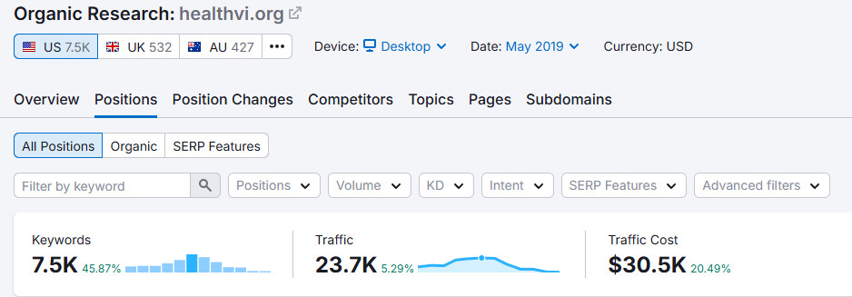
I’ve taken brand-new websites from zero to thousands of visitors a day by designing them to be found, not just admired — and a site that’s built to get more visitors earns its money back in a way a pretty-but-hidden one never will.
Why a Beautiful Website Can Still Lose You Money
Spending big on how a site looks while ignoring whether it works is the most common expensive mistake I see business owners make.
Don’t get me wrong — looks matter.
A visitor forms a first impression of your site in about 50 milliseconds, faster than a blink, and research out of Stanford found that 75% of people judge a company’s credibility on its website design. An ugly, dated site genuinely costs you trust.
But here’s the trap: “looks trustworthy” and “brings in customers” are different goals, and it’s easy to spend your entire budget on the first while forgetting the second.
A first impression nobody arrives at is worth nothing. Trust that never gets the chance to turn into an enquiry is just decoration.
That’s the lesson from the $10,000 site. The money went almost entirely into how it looked, and almost none into whether the right people would ever find it or know what to do once they did.
The fix wasn’t a prettier logo. It was design that pulls its weight: built to be found, built to guide, built to convert.
A good rule for spending: every dollar should buy you customers, not compliments. Compliments feel great. Customers pay the bills.
Common Web Design Mistakes NZ Businesses Make
Most struggling business websites fail in the same handful of ways — and once you can spot them, you can fix them.
Here’s what I see again and again on New Zealand business sites:
- No clear main action. The page looks fine but there’s no obvious “do this next.” Visitors drift, then leave.
- Built to impress peers, not customers. Heavy on clever animations and design-award flourishes, light on the plain information a buyer actually wants — prices, location, how to get in touch.
- Ignoring mobile. Designed on a big screen, never properly checked on a phone, where most visitors actually are.
- Too slow. Oversized images and a heavy theme that take five-plus seconds to load while customers tap away.
- Impossible to find. A lovely site with no thought given to whether it ranks for anything anyone searches.
The good news: every one of these is fixable, and most are cheaper to fix than the original mistake was to make.
If your site isn’t pulling its weight and you’re not sure why, the quickest way to get clarity is a free website audit that shows exactly what’s holding it back.
Industry matters here too. A dentist whose site looks great but never shows up in local search has a findability problem, not a looks problem — and SEO for dentists fixes a different thing than a redesign ever will. Match the fix to the actual fault.
Should You DIY Your Web Design or Hire an Expert?
If your website is just a simple online presence, DIY is fine. If it needs to bring in customers, the principles above get a lot harder to pull off alone.
Modern website builders are genuinely good now. If you need a basic, tidy site — a one-pager, a portfolio, a holding page — you can absolutely build something clean yourself, and you should. No shame in it.
The line gets crossed when the website is meant to be a real channel for leads or sales. A site that performs follows a proper web design process — planning the purpose, mapping out the pages, designing around the one action, then testing before it goes live.
Getting clarity of purpose, visual hierarchy, speed, and findability all working together is the difference between a site that looks done and a site that performs — and that’s where most DIY builds quietly fall short. They tick the “it exists” box and miss the “it earns” one.
This is where handing it off pays for itself.
Whether that’s a designer who actually understands conversion, professional SEO help so the thing gets found, or even a few hours of SEO consulting to point your own build in the right direction — the cost of getting it right is almost always smaller than the cost of a website that just sits there.
A website is one of the few business assets that can work for you 24 hours a day — so build it like it matters, because it does. And if you’d rather have it built to earn from day one instead of just exist, that’s where we come in.