

You’ve seen a website like this.
Sharp logo, tidy photos, modern fonts — the kind of site that clearly cost a few grand to build. And it probably did. But the enquiries trickle in at a rate that doesn’t come close to matching how good it looks.
That gap is the whole problem with how web design usually gets sold. It’s pitched as how a site looks — and the look is only a slice of what actually matters.
Web design is the work of planning how a website looks and works, and it’s made of a lot of moving parts.
Some of them make the site look good. Some of them turn a visitor into a customer. And some of them decide whether anyone ever finds the site in the first place.
Get the pretty ones right and ignore the other two groups, and you end up with exactly that: an expensive site that sits there quietly.
This guide breaks down every element of a web design, what “good” looks like for each one, and — running quietly underneath the whole thing — which elements get you found and which ones win the sale. Not just which ones look nice.
What Are the Elements of Web Design?
The elements of web design are the building blocks that make up a website: layout, colour, typography, imagery, white space, navigation, content, calls to action, social proof, mobile responsiveness, page speed, and SEO.
Together they decide how a site looks, how it guides people, and whether it can be found and used.
It’s worth drawing one quick distinction, because people mix these up constantly. The elements are the building blocks — the actual parts of the page.
The principles of web design are the rules for arranging those parts well, like balance, contrast and consistency. This guide is about the elements; the principles are how you put them to work.
You’ll see this list counted as “the 5 basic elements,” “the 7 elements,” or “the 10 most important elements,” depending on who’s writing.
The number changes because some guides bundle a few together (calling colour, typography and imagery one thing called “visual style”) and some split them apart. The job each element does doesn’t change, so don’t get hung up on the count.
The more useful way to read the list is by what each element is for. Some make a site look good. Some make it convert.
Some make it findable. A web design that’s missing a whole one of those groups is missing the point — and that’s the lens we’ll keep coming back to.
Layout and Visual Hierarchy
Layout is how everything is arranged on the page. Visual hierarchy is the order your eye travels in — what a visitor sees first, second, and not at all.
This matters more than most people realise because of how fast we judge a page.
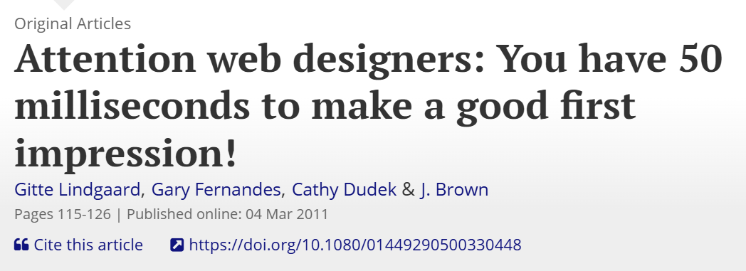
Research from Carleton University found that people form a first impression of a website in about 50 milliseconds — faster than a conscious thought. In that blink, layout is doing most of the talking.
Good layout uses a grid to keep things aligned and gives the eye an obvious path to follow.
Most people scan in a Z or an F shape, so the things that matter — your main message, your booking button — go where that path naturally lands, not buried halfway down.
Take a café in Auckland. The kind of web design in Auckland hospitality that works puts the menu and the “book a table” button exactly where the eye settles first, instead of making people hunt. The layout is doing a job, not just sitting there looking balanced.
Colour
Colour sets the mood and signals what kind of business you are before a single word is read.
A good colour palette usually runs on two or three core colours plus one accent colour you save for the things you want clicked.
Contrast is the part people skip — light grey text on a white background looks elegant in the design file and is unreadable on a phone in daylight.
The practical move: pick colours that match the feeling you want (calm and trustworthy reads very differently to bold and energetic), then use your accent colour only for buttons and links so it always means “this is what to do next.”
Colour is a trust signal, not a chance to use every shade you like.
Typography
Typography is the fonts you use and how the text is set — and readability beats cleverness every time.
Most of a website is words, so this carries more weight than people give it. Stick to one or two fonts, keep body text large enough to read comfortably on a phone (around 16px and up), and give your lines room to breathe with decent spacing.
Headings should be clearly bigger than body text so the page has an obvious structure you can skim.
A clever display font might look great in the logo. Run the whole site in it and you’ve made every paragraph harder to read, which quietly costs you the people who would’ve kept scrolling.
Imagery and Video
Images and video carry meaning faster than text — as long as they’re real.
Stock photos of models in a generic office fool nobody, and worse, they make a business look interchangeable.
Real photos of your actual team, premises and finished work do the opposite: they build trust and double as proof.
A Hamilton trades business showing real before-and-after shots of its own jobs is far more convincing than any stock library, and those photos also feed image search, so they pull double duty.
Where you do need graphics, keep them consistent in style so the site feels like one place, not a scrapbook.
White Space
White space is the empty room around your elements — and it’s the first thing nervous business owners try to cut.
The instinct is to fill every gap with another message, another button, another logo. The result is a cluttered page where nothing stands out because everything is shouting.
Space around an element is what makes it readable and what makes the important things obvious.
You don’t need to fill the page. You need to make the few things that matter easy to find. White space is how you do that.
Navigation
Navigation is how people move around your site — and if they can’t find what they came for in a couple of clicks, they leave.
This is the first real conversion element, because a visitor who gets lost never gets to the part where they enquire.
Good navigation means a simple, clearly labelled menu (five or six items, not fifteen), a logical structure, and on bigger sites, a search box and breadcrumbs so people always know where they are.
Label your menu items in plain language your customer uses, not internal jargon. “Pricing” beats “Engagement Options.”
A multi-service NZ business with everything crammed into one dropdown is asking visitors to do work — and most won’t.

Content
Content is the actual words on the page, and it’s what answers the visitor’s question and earns the enquiry.
The mistake almost everyone makes is writing about themselves — “we are a leading provider of…” — when the visitor only cares about their own problem.
Good content leads with what the customer wants, says it in plain English, and is laid out to be scanned: short paragraphs, clear subheadings, the key point first.
Content is also the element that gets you found. The words on your pages are what Google reads to work out what you do and who to show you to, which is where on-page optimisation meets writing.
A Christchurch law firm that writes a clear page answering “what does it cost to contest a will in NZ” is helping a real person and giving search engines something to rank at the same time.
Calls to Action (CTAs)
A call to action tells the visitor exactly what to do next — and a page without a clear one is a conversation that never closes.
Every page should have one obvious primary action. Make it specific (“Get a free quote” beats a vague “Learn more”), give it your accent colour so it stands out, and repeat it down the page so the visitor never has to scroll back up to act.
One primary action per page keeps the decision easy; a page asking people to call, email, book and download all at once usually gets none of them.
Think about where someone is ready to act. On a service page, the CTA belongs right after you’ve explained the benefit and shown some proof — that’s the moment they’re convinced, so that’s where the button goes.
Social Proof and Trust Signals
Social proof is the evidence that other people trust you — reviews, testimonials, results, client logos, guarantees — and it’s the element most NZ business sites leave out entirely.
People don’t take your word for it; they take other people’s. Reviews are now part of nearly every buying decision — BrightLocal’s research found that only around 4% of consumers never read online reviews when choosing a local business.
If your site doesn’t show that proof, visitors go looking for it elsewhere, and you’ve lost control of the story.

Put your strongest proof where decisions happen: a row of Google reviews near your main CTA, a real client result on your service pages, recognisable logos of businesses you’ve worked with. Specific beats vague — “saved us 12 hours a week” lands harder than “great to work with.”
Trust signals like a clear phone number, a physical NZ address and security badges on checkout pages do quiet work too.
Mobile Responsiveness
Mobile responsiveness means the site reshapes itself to work properly on any screen — and since most of your visitors are on a phone, this isn’t a nice-to-have.
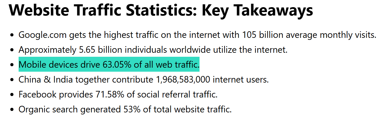
Around 60% of all web traffic now comes from mobile devices, and for a lot of local businesses it’s higher.
A site that looks great on a designer’s big monitor but breaks on a phone — tiny text, buttons too close to tap, a menu that won’t open — is failing the majority of the people who land on it.
The fix is to design mobile-first: get it working on the small screen, then let it expand to desktop. Test it on a real phone, not just by shrinking your browser.
Tap targets need room, text needs to be legible without pinching, and the most important button should be reachable with a thumb.
Google also indexes the mobile version of your site first, so a poor mobile experience hurts your rankings as well as your visitors.
Page Speed
Page speed is how fast your site loads — and every extra second quietly costs you visitors and rankings.
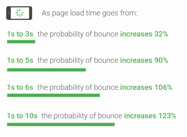
People are impatient, and the data is brutal. Google’s research found that as a mobile page’s load time goes from one second to ten, the chance of someone bouncing jumps by 123%.
The flip side is just as real: Google and Deloitte’s “Milliseconds Make Millions” study found that a 0.1-second improvement in load time lifted conversions by 8.4% for retail sites, with similar gains in lead generation.

What slows a site down is usually the obvious stuff: huge unoptimised images, a bloated theme with features you don’t use, and no caching.
A lot of this sits on the development side rather than the design side — the build under the bonnet, not the look on top — and the two get confused all the time.
Compress your images, choose a lean build, and add a caching plugin, and you’ll often halve your load time without touching the design. Speed sits inside Google’s Core Web Vitals, so it’s a ranking factor as well as a conversion one.
SEO and Findability
SEO is the element that decides whether anyone ever sees the site. A beautiful website nobody can find is a brochure locked in a drawer.
This is the part pure-design articles skip, and it’s the most expensive thing to get wrong. The most gorgeous site in your industry earns nothing if it sits on page five of Google.
Findability gets baked in through the build: a logical site structure, proper headings, descriptive page titles, fast load times, clean code, and content written around what people actually search for.
Design and SEO aren’t separate jobs done by separate people — they’re the same job. The decisions a designer makes about structure, speed and content are the same decisions that determine whether you get more visitors from search.
That’s the entire approach behind our SEO company: a website should be found, not just admired. It’s how a brand-new Expert SEO domain ended up outranking NZ agencies with a decade’s head start — the site was built to rank from day one, not retrofitted later.

How These Elements Work Together
On their own, these are just parts. The result comes from how they chain together — each element handing the visitor to the next.
Picture a builder in Hamilton. Someone searches “deck builder Hamilton,” and good SEO and page speed get the site found and loaded before they lose patience.
The layout and hero put a sharp photo of a finished deck and a clear headline right where the eye lands. Real job photos and a row of Google reviews build trust.
The content answers the obvious questions about cost and timeframe. Then a single clear “Get a free quote” button closes it. The right Hamilton web design makes that whole chain feel effortless.
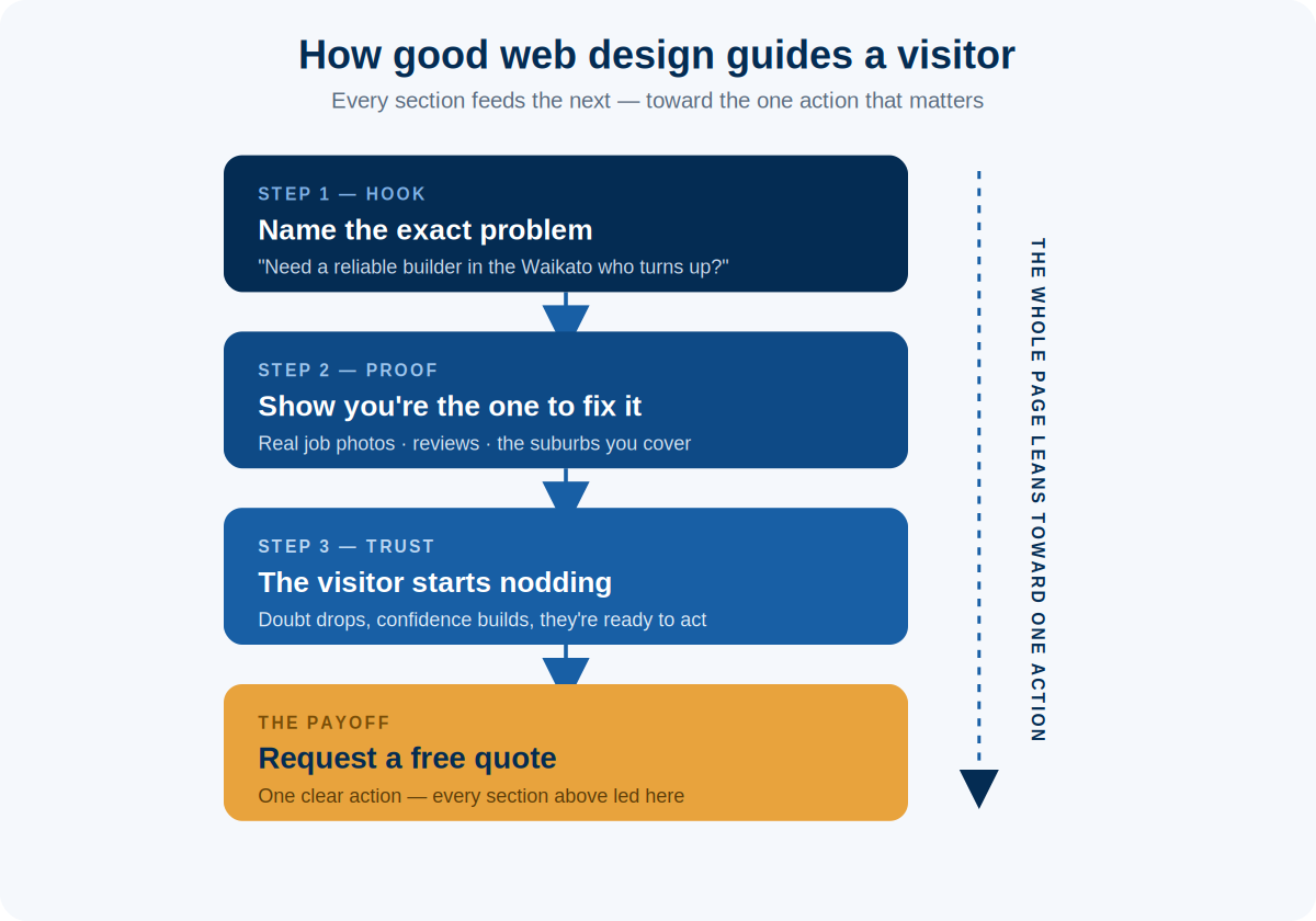
Now pull one link out. A slow site means they bounce before the hero loads. No reviews means they don’t trust it. A buried CTA means they read everything and then leave with nowhere to click. One weak element breaks the chain, no matter how good the others are.
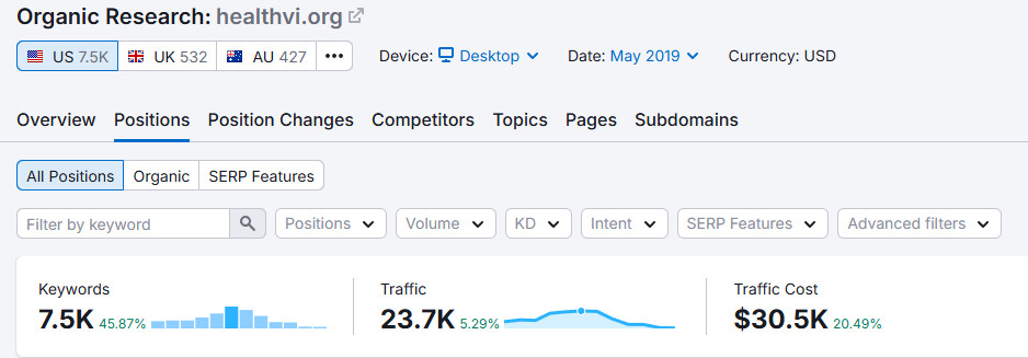
This is the thing I’ve seen play out again and again. I grew a health site, HealthVI, from zero to over 20,000 visitors a month — and that didn’t come from one clever element.
It came from content people wanted, a site that loaded fast and worked on mobile, and SEO underneath holding it all up. The elements compound. That’s where the real results live.
Where Most NZ Business Websites Fall Short
The sites that underperform usually aren’t ugly. They’re missing the elements that do the work.
The same handful of gaps come up over and over: a good-looking page with no clear call to action, so visitors have nothing obvious to do. No social proof, so there’s nothing building trust.
A site that’s slow or broken on mobile, losing most of its audience before they see anything.
A vague hero section that doesn’t say what the business actually does in the first five seconds. And the big one — a site built purely to look good that’s invisible on Google, so the only people who ever see it are the ones who already had the link.
Each of those is a missing element from the list above, and each one is fixable once you know to look for it.
So run your own site past the list and be honest about the weakest area. If it looks great but gets no enquiries, your gap is in the flow — the CTAs, the proof, the navigation.
If it gets almost no visitors at all, your gap is in the foundation — speed, mobile and SEO. Fix the weakest element first, and you’ll usually see the difference faster than a full redesign ever would.
Should You DIY These Elements or Hire a Web Designer?
Modern page builders make the visual elements genuinely easy to DIY. It’s the conversion and findability elements — the ones that actually bring in enquiries — that quietly trip people up.
If you’ve got the time and patience, you can absolutely build a clean, good-looking site yourself on a tool like WordPress or Squarespace.
A solid build follows a clear web design process — planning, design, build, then launch — and where DIY sites tend to fall down is the invisible stuff inside it: structuring the site so it ranks, getting speed right, and building the flow that moves a visitor toward a decision.
Those take experience to get right, and they’re the parts that decide whether the site pays for itself.
If the website is meant to bring in real business, it’s usually worth handing the build to a team that does professional website design day in, day out — especially one that treats SEO as part of the build rather than an afterthought.
And if you already have a site, the honest first move is an SEO audit to see whether it can even be found, before you spend a cent on how it looks. A site that looks good and gets found is the one that earns its keep — and that’s where we come in.
Elements of Web Design: FAQ
What are the 5 basic elements of web design?
The five basic elements most guides agree on are layout, colour, typography, imagery, and navigation. Together they cover how a page is arranged, how it looks, the text people read, the visuals that support it, and how visitors move around the site.
What are the 7 website design elements?
A common list of seven is layout, colour, typography, imagery, content, navigation, and white space. Some versions swap white space for calls to action or mobile responsiveness — the labels shift, but they’re describing the same core building blocks.
What are the 5 major components of a web page?
The five major components of a typical web page are the header (logo and navigation), the hero section (your main message and primary call to action), the body content, the calls to action, and the footer (contact details and secondary links).
What are the 7 C’s of website design?
The 7 C’s are context, content, community, customisation, communication, connection, and commerce. It’s a framework for designing the customer experience: how the site looks and works, what’s on it, how it lets people interact, how it adapts to them, and how it supports getting in touch and buying.
What makes a good website design?
A good website design does three things at once: it looks credible, it guides visitors toward an action, and it can be found on Google. Strong visuals earn attention, clear flow and social proof win the enquiry, and solid technical foundations and SEO make sure people arrive in the first place. A site that nails only one of those falls short.
Recommended Reading

Build a high-converting website
What turns a good-looking page into one that actually generates enquiries.

Best website design examples
Real NZ sites worth learning from, and exactly what makes each one work.

The web design checklist
Everything to get right before and after launch, in one run-through.