

Picture this. You’re sitting in a café in Hamilton, flat white going cold, and you pull up your own website on your phone to show a mate what you do.
The text is microscopic. You’re pinching and zooming just to read your own headline. A “Get a Quote” button is sitting half off the edge of the screen, and when you go to tap it, you hit the wrong thing.

Here’s the uncomfortable bit: if that’s what your site does on your phone, that’s the version most of your customers are seeing. And it’s the version Google is using to decide where you rank.
This guide is the plain-English version of responsive web design — no code, no jargon.
By the end you’ll know what it actually is, why your mobile site quietly decides your rankings and your leads, how to check your own site in about two minutes, and what to do if it fails.
What Is Responsive Web Design?
Responsive web design is an approach where one website automatically adjusts its layout, images, and text to fit whatever screen it’s viewed on — phone, tablet, or desktop — so it stays easy to read and use everywhere.
That’s the whole idea in one sentence: one site, that reshapes itself to fit the screen.
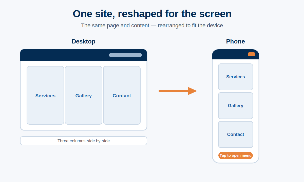
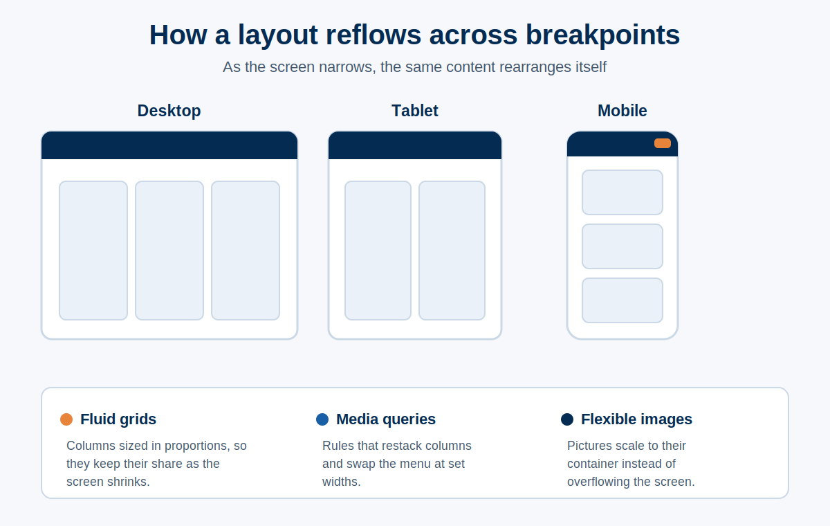
Here’s an example: say you run a landscaping business and your homepage has three columns on a desktop — services on the left, a photo gallery in the middle, contact details on the right.
On a responsive site, when that same page loads on a phone, those three columns don’t shrink down into unreadable little strips.
They stack, one on top of the other. The menu collapses into a tidy little icon. The buttons grow so a thumb can actually hit them.
Same page, same content — it just rearranges itself for the screen it’s on.
The old way of doing this was to build a separate mobile site sitting on its own address (you’d see “m.” at the front of the web address).
It was a headache to maintain and things constantly fell out of sync. Responsive design killed that off. One site does the lot.
Why Responsive Web Design Matters for NZ Businesses
It matters because most of your customers are already on a phone, and a site that’s hard to use on mobile costs you enquiries before anyone ever contacts you.
This isn’t a maybe. The majority of the world’s web traffic now comes from mobile phones, and for a lot of local NZ businesses the mobile share is higher again — people searching “plumber near me” or “physio Tauranga” are almost always doing it on the phone in their hand, right when they need it.
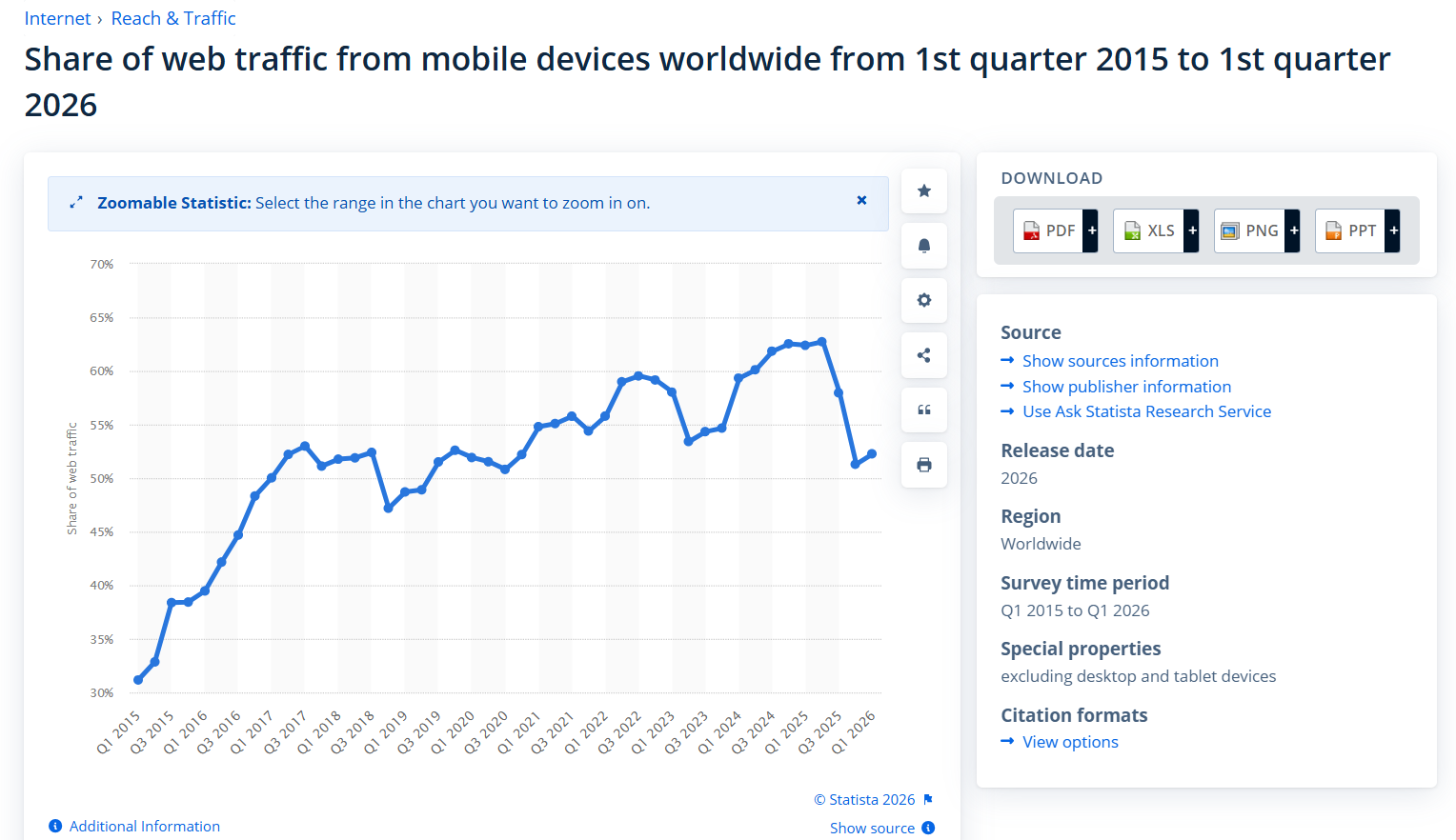
So your phone visitor is the main event, not a minority you can deal with later.
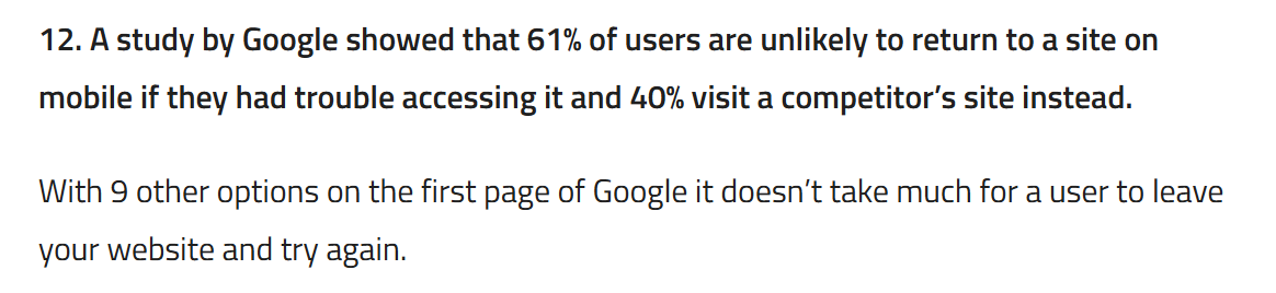
And they are ruthless. A Google study found that 61% of people won’t return to a site on mobile if they had trouble using it, and 40% just go straight to a competitor instead.
Think about what that means on the ground. Someone’s searching for an emergency electrician on a Friday night. They land on your site, can’t read it, can’t find the number, and within five seconds they’ve bounced back to Google and tapped the next result. That lead was yours. Now it’s the sparky down the road’s.
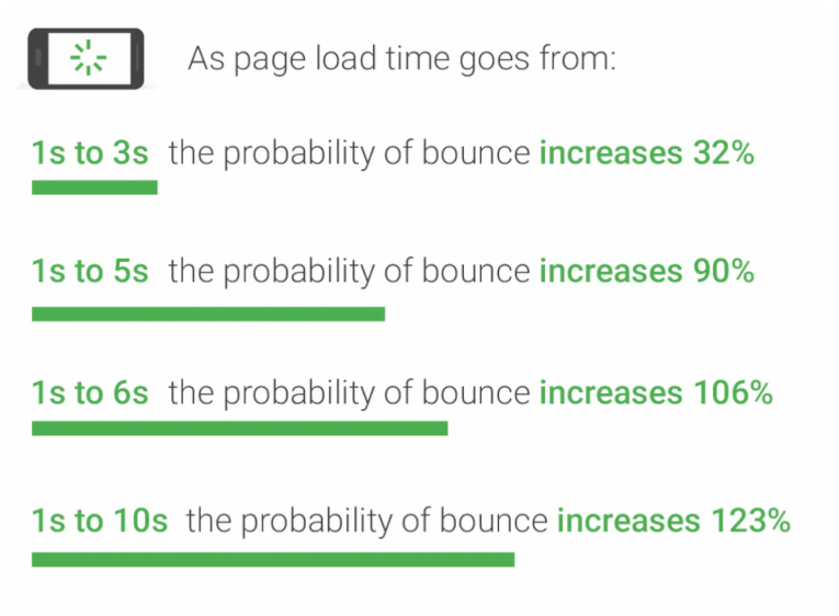
Speed makes it worse. As a mobile page’s load time creeps from one second to three, the chance of someone bouncing jumps 32% — and at ten seconds it climbs 123%.
A clunky non-responsive site that loads a giant desktop layout onto a phone is exactly the kind of thing that drags those times out.
A responsive site is the difference between catching that customer and feeding them to the business next door.
Google Ranks Your Mobile Site, Not Your Desktop One
Here’s the part nearly every other guide skips, and it’s the most important one for anyone who cares about being found.
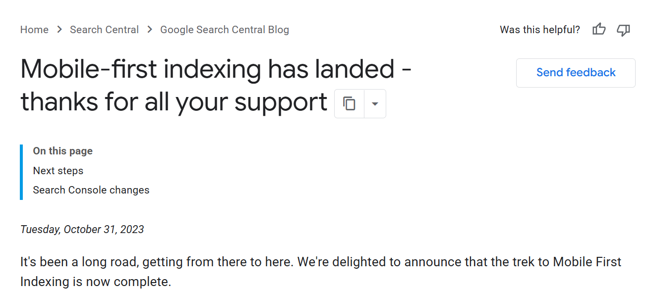
Google now uses the mobile version of your site as the main version it judges — for indexing and for ranking.
Even when someone searches on a laptop, the rankings they see were mostly worked out from your mobile site. This is called mobile-first indexing, and Google finished rolling it out across the whole web.
Sit with that for a second.
For years, the thinking was: build a proper desktop site, then bolt on a mobile version as an afterthought.
Mobile-first indexing flips that on its head. Your mobile site is the one being graded. If it’s a stripped-back, broken, slow version of your real site, then a broken slow version is what Google is ranking. You’re being judged on your weakest link.
This is squarely where responsive design and SEO meet. The same mobile experience that decides whether a customer stays also feeds the signals — load speed, usability, content — that the technical side of SEO runs on.
A law firm chasing “family lawyer Christchurch” can write the best content in the city, but if it renders as a mess on a phone, it’s handing the ranking to a competitor whose site simply works.
That’s law firm SEO won and lost on something most firms never think to check.
Google’s own advice backs this up. When they explained the move, Google recommended responsive web design as the way to build for it, and told people to avoid those old separate mobile addresses.

Now, one honest note, because at our SEO company we’ve been doing this for over a decade: making your site responsive won’t magically rocket you up the rankings.
It clears a handicap that’s been holding everything else back — your content, your links, your authority — so they can finally move you up the rankings.
A non-responsive site is running the race with its shoelaces tied together. Fixing it won’t win the race for you, but it finally lets you run it properly.
How Responsive Web Design Actually Works
Three things happen behind the scenes to make a site responsive. You’ll never have to build these yourself — but knowing they exist helps you tell a site that was done properly from one that was thrown together.
Fluid grids. Instead of fixing the layout to set pixel widths, everything is sized in proportions.
So a column that takes up a third of the screen on desktop keeps taking up its share as the screen shrinks, rather than spilling off the edge. The layout stretches and squeezes to fit.
Media queries. These are simple rules that say “when the screen is this narrow, do this instead.”
On a small screen, stack those three columns into one. Hide the big hero image. Swap the full menu for a tap-to-open icon. It’s the site reacting to the screen size and rearranging itself on the spot.
Flexible images. Pictures are set to scale within their container, so a photo that looks great on a 27-inch monitor shrinks down neatly on a phone instead of blowing out the screen and forcing that dreaded sideways scroll.
Responsive vs adaptive: what’s the difference?
You might hear “adaptive design” thrown around like it’s the same thing. It isn’t, quite. Responsive design flexes smoothly to any screen size, like water filling whatever glass you pour it into.
Adaptive design uses a handful of fixed layouts built for specific screen sizes, and snaps to the closest one.
For almost every NZ business, responsive is the right call. It handles the endless variety of phones, foldables, and tablets people actually use without you having to guess at sizes.
Adaptive has its place in some big custom builds, but if you’re a local business, you want responsive.
How to Tell If Your Website Is Already Responsive
You can check whether your own site is responsive in under two minutes, no technical skills needed. Here are three ways, easiest first.
1. The phone test. Open your website on your own phone. Look for the warning signs: do you have to pinch and zoom to read anything? Is there a horizontal scroll bar letting you swipe the page sideways (there shouldn’t be)?
Are buttons tiny, or jammed so close together you tap the wrong one? Does the menu work with a thumb? If it feels like a fight, your customers are losing that same fight.
2. The browser-resize test. On a laptop, open your site and slowly drag the corner of the browser window inward to make it narrow. Watch what happens.
On a responsive site, the layout reflows as you shrink it — columns stack, the menu collapses, everything stays readable. On a non-responsive site, the page just gets clipped, and a scroll bar appears along the bottom. That scroll bar is the tell.
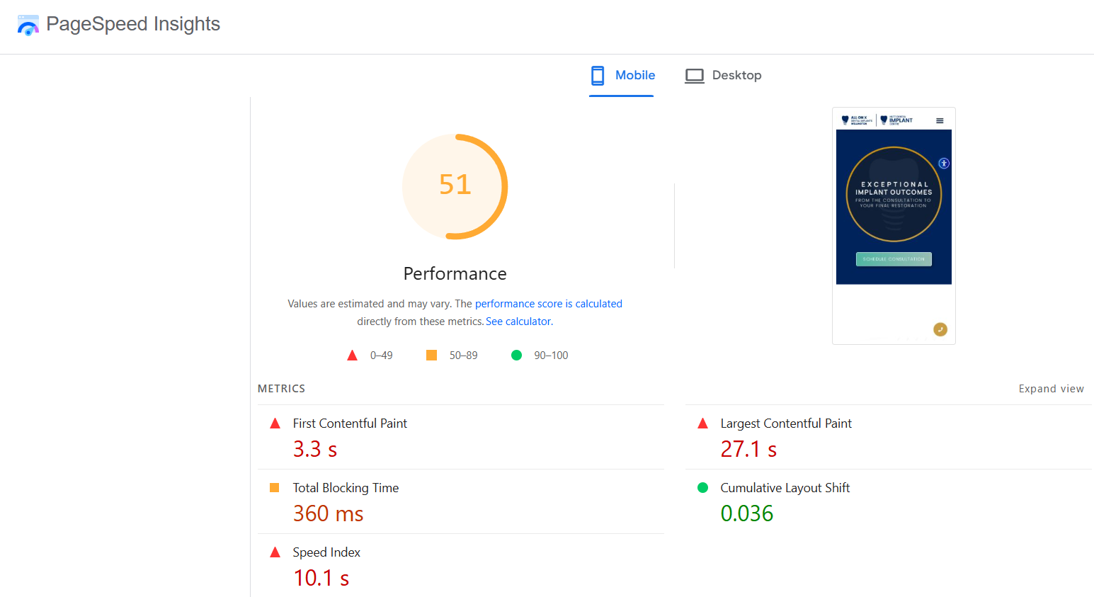
3. Google’s own check. Google’s PageSpeed Insights tool (free, just search for it) tests your page and flags mobile usability and speed problems directly.
It’ll tell you if your text is too small, if tap targets are too close, or if the page is loading like a brick on mobile. A “fail” here isn’t just a UX gripe — remember, this is roughly what Google sees when it ranks you.
If your site flunks all three, don’t panic. It’s fixable. That’s the next section. And if you’d rather have someone hand you a full read on what’s holding the site back, a proper SEO audit covers mobile responsiveness alongside everything else.
How to Make Your Website Responsive
If your site isn’t responsive, you’ve got three realistic paths. Which one fits comes down to how old and how broken your current site is.
Option 1 — Switch to a responsive theme. If you’re on a platform like WordPress and your site is reasonably modern underneath, you might just need a responsive theme or template.
Most decent themes built in the last few years are responsive out of the box. This is the cheapest route — but it’s only an option if the bones of the site are sound.
Option 2 — Rebuild on a modern platform. If your site is genuinely old or was built in something that pre-dates the mobile era, patching it is a false economy.
A rebuild on a modern setup — WordPress is the workhorse here and runs more than 40% of the web, or a builder like Wix for something simpler — gives you a responsive foundation and a clean slate to actually rank from.

Option 3 — Hire someone to do it properly. More on the DIY-versus-hire call below, but for a lot of business owners this is the honest answer: it’s not your job, and the hours you’d sink into wrestling with it are worth more spent running your business.
Why a DIY builder site can still fail on mobile
Here’s the trap. You build a site on a drag-and-drop builder, it says “mobile responsive” on the box, so you assume you’re sorted.
Then you check it on a phone and the spacing’s all wrong, a heading’s overlapping an image, and a button’s vanished off the side.
“Responsive template” doesn’t mean “responsive site.”
The template gives you a responsive starting point, but the moment you drag elements around, paste in a wide image, or build a custom section, you can break it on mobile without ever seeing the damage — because you built it on a desktop and never looked at the phone view.
This is the single most common way DIY sites quietly leak customers.
The fix is dull but vital: check every page on an actual phone before you call it done.
What responsive web design costs in NZ
Honest ranges, because nobody else seems to want to give you a number:
- DIY on a builder: essentially the cost of your subscription (often $20–$50 a month) plus your time — and the time is the real cost.
- A freelancer or small studio for a responsive rebuild: anywhere from roughly $1,500 to $5,000 for a straightforward small-business site, depending on page count and how custom it gets.
- A full agency build: $5,000 and up, into five figures for bigger, more bespoke work.
The right number depends entirely on what you need. A two-page site for a sole-trader sparky is a different job from a thirty-page site for a multi-branch firm.
When to Do It Yourself vs Hire a Professional
DIY is genuinely fine if your site is simple and you’ve got the patience to test it properly on real devices. A one-page site for a market stall or a side hustle? Have a crack at it yourself.
The calculation changes the moment your website is also your main source of leads.
When the site is the thing bringing in the work, the cost of getting it wrong on mobile — lost enquiries, lost rankings, customers handed to competitors — quickly dwarfs whatever you saved by doing it yourself.
At that point it stops being a saving and starts being a leak.
When a Hamilton business invests in a fresh, responsive build through website design Hamilton — fast, mobile-first, built to rank from day one — what they’re really buying is the end of a quiet leak: the customers a broken mobile site was costing them every week.
That’s the whole point of professional website design: a site that works on the device your customers are actually holding.
If you’re weighing it up and the leads matter, that’s where we come in.