

Type “mobile SEO” into Google and you’ll find dozens of guides treating it like a separate beast. Its own checklist. Its own tactics. Its own service you apparently need to buy.
Here’s the truth after a decade of doing this: there’s no version of mobile SEO that’s separate from regular SEO.
It’s one discipline. Google looks at the mobile version of your site to decide where you rank — for everyone, on every device.
So when people say “mobile SEO,” they’re really just talking about SEO, done with the obvious fact that most of your visitors, and Google’s crawler, are on a phone.
That doesn’t mean there’s nothing to do. There’s plenty — responsive design, load speed, buttons you can actually tap with a thumb. This guide walks through all of it, with real NZ examples.
It’ll also show you how to test your site the right way, because the tool most guides still point you to has been dead since 2023.
Let’s get into it.
What Is Mobile SEO?
Mobile SEO is the practice of making sure your website ranks well and works properly for people searching on a phone.
It covers how your pages load on a small screen, how easy they are to read and tap, and how Google ranks them — because Google now judges your site by its mobile version first.
Say you run a café in Hamilton.
Someone two streets away pulls out their phone and searches “brunch near me.”
Mobile SEO is everything that decides whether your café shows up, and whether the person who taps through gets a fast, readable page instead of a pinch-and-zoom mess that sends them straight back to the results.
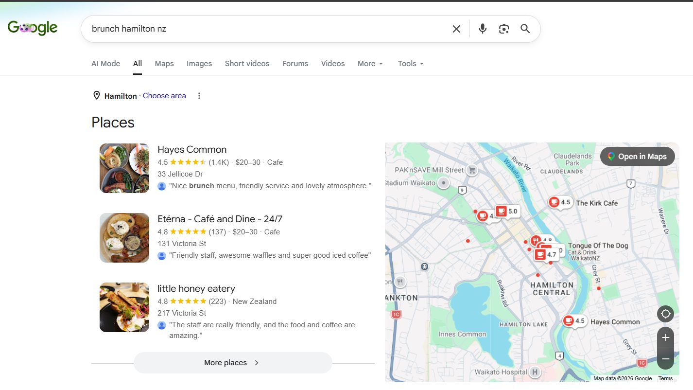
Same SEO you already know. Just judged on the screen that actually matters.
Is Mobile SEO Different From Desktop SEO?
No. And anyone telling you it’s a completely separate discipline is either out of date or selling you a service you don’t need.
A few weeks ago I was reading the “mobile SEO” page of a New Zealand agency.
It was pitched as this whole separate offering — a distinct package, a distinct strategy, distinct pricing, the lot. Different keywords, different rules, a different game you had to hire them to play.
It’s nonsense.
Politely: that agency doesn’t deserve your money, and neither does anyone running the same playbook.
There aren’t two SEOs. There’s one. The reason it leans mobile-first isn’t philosophy — it’s mechanical, and it comes down to one thing Google changed years ago.
What mobile-first indexing actually means
Google uses mobile-first indexing. That means it crawls and ranks the mobile version of your site, then uses that version to decide where you sit in the results — even for someone searching on a desktop.
The mobile version is the version that counts. Full stop.
So you’re not optimising for “mobile” as some side-quest bolted onto real SEO. The phone version is the real SEO.
If your content, your speed, or your structure falls apart on a phone, that doesn’t just cost you mobile visitors. It drags your rankings down everywhere.
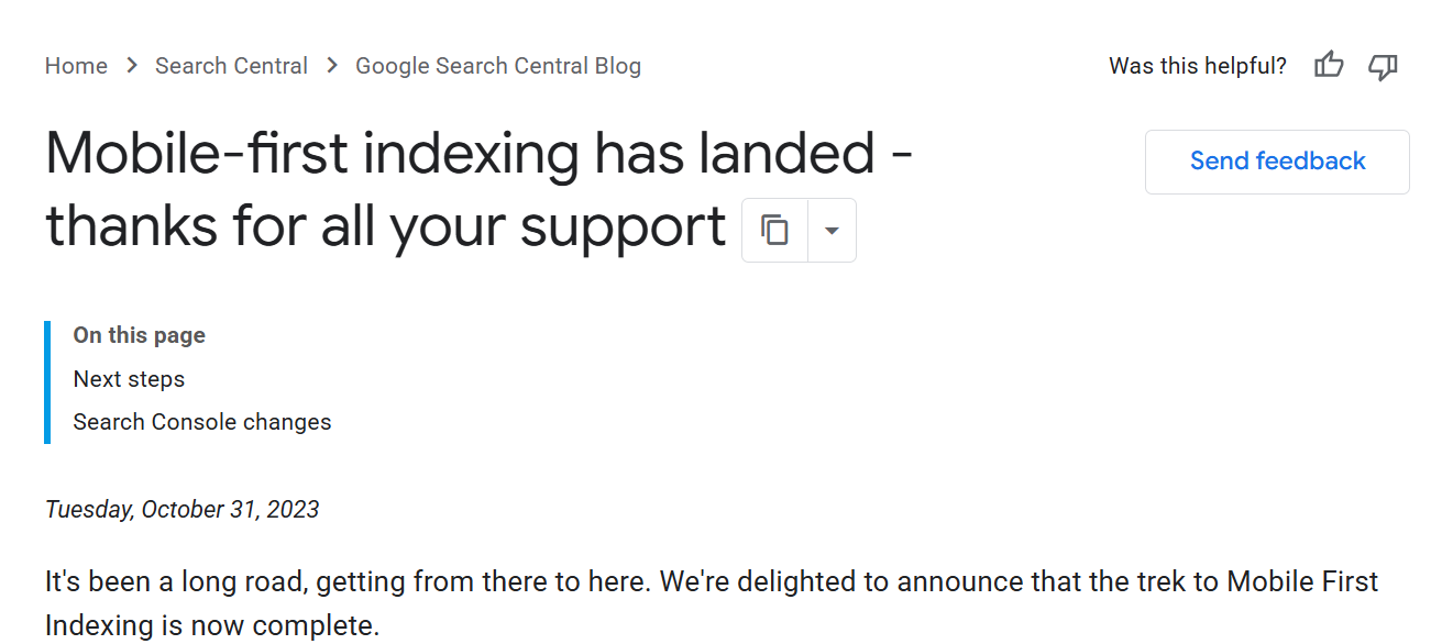
The numbers behind it
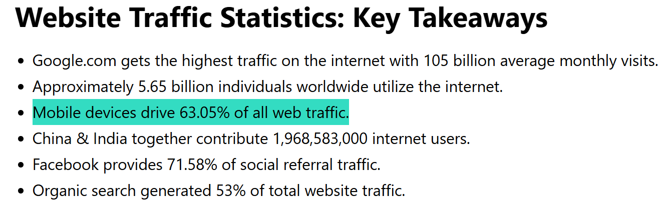
This isn’t a niche concern. Mobile has been the majority of web traffic since 2016, and it sits at around 60% of all global web traffic today.
For most local NZ businesses the figure is even higher.
A dentist, a mortgage broker, a café — the bulk of the people finding them are on a phone, often out and about, often ready to act right now.
Build for the phone first, then make sure it still looks great on a desktop. Not the other way around.
That single shift in mindset is the whole of “mobile SEO” — and it’s why treating it as a separate service is a con.
How to Do Mobile SEO
“It’s just SEO” doesn’t mean do nothing. A handful of things genuinely change how your site performs on a phone, and getting them right is most of the battle.
Here’s the actual work.
Use a responsive design
A responsive design is one website that automatically reshapes itself to fit any screen, from a 27-inch monitor to a phone, using a single set of pages and one URL.
Google recommends it for a simple reason: one URL means one page to crawl, one page to index, and no risk of a stripped-down “mobile site” hiding half your content from the crawler.
Everything Google sees on desktop, it sees on mobile too.
How to check you’ve got it:
- Open your website on a desktop browser.
- Grab the edge of the window and drag it narrower, slowly, down to phone width.
- Watch what happens. On a responsive site, the layout reflows — columns stack, the menu collapses into a hamburger, text stays readable. On a non-responsive site, things get cut off, you get a sideways scrollbar, or the text shrinks to ant-size.
Most modern WordPress, Shopify and Squarespace themes are responsive out of the box.
If yours was built more than about eight years ago, or someone bolted on a separate “m-dot” mobile site, that’s worth fixing first.
Make your site load fast
Speed is the single biggest mobile SEO lever for most NZ sites, because phones are often on slower mobile data, not wifi.
Google’s own research is blunt on this: the slower your page loads on a phone, the more visitors leave before they ever see it.
They don’t wait. They bounce back and tap the next result, which is usually a competitor.
The way Google measures this now is Core Web Vitals: three specific scores that grade the real experience of loading your page.
- LCP (Largest Contentful Paint) — how long until the main content appears. Aim for under 2.5 seconds.
- INP (Interaction to Next Paint) — how quickly the page responds when someone taps or scrolls. (This one replaced the old FID metric in 2024.) Aim for under 200 milliseconds.
- CLS (Cumulative Layout Shift) — how much the page jumps around while it loads. You want it near zero — nothing worse than going to tap a button and an ad shoves it down half a second too late.
The tool to check all of this is Google PageSpeed Insights.
What it is: a free Google tool that grades any URL’s speed and Core Web Vitals on both mobile and desktop, then lists exactly what’s slowing it down.
How it helps: it separates your mobile score from your desktop score (they’re often wildly different), and it tells you the specific culprits — usually oversized images, render-blocking code, or a bloated theme — instead of leaving you guessing.
How to use it:
- Go to pagespeed.web.dev.
- Paste in your page URL and hit Analyse.
- Read the Mobile tab first — that’s the one Google ranks on.
- Scroll to “Opportunities” and “Diagnostics.” Start at the top; those are the biggest wins.

Nine times out of ten, the number one fix is images. A single 4MB hero photo straight off a phone camera will tank a mobile score on its own. Run your images through a free tool like TinyPNG (drag, drop, download the compressed version, re-upload) before they ever go on the site. It routinely cuts file sizes by 60–70% with no visible quality loss.
Size your buttons and links for thumbs
People navigate phones with their thumbs, not a pixel-perfect mouse pointer. If your buttons and links are tiny and crammed together, they’ll mis-tap, get frustrated, and leave.
The fix: make tap targets at least around 48 pixels tall, and give them breathing room so two links aren’t stacked right on top of each other.
Picture that Hamilton café again. Its “Book a Table” button needs to be a big, obvious, thumb-sized target near the top of the page. Not a tiny text link wedged between the address and the opening hours, where half the taps land on the wrong thing.
Make your text readable without zooming
If a visitor has to pinch and zoom to read your page, you’ve already lost them.
Three things keep mobile text readable:
- Body text around 16px or larger — anything smaller forces zooming.
- Short paragraphs — one to three lines on a phone. Big walls of text are punishing on a small screen.
- Real spacing — line height and gaps between sections so the eye can move down the page easily.
This overlaps almost entirely with good on-page SEO. Content that’s easy to scan on a phone — short paragraphs, clear subheadings, the answer up top — is exactly what Google and AI search reward anyway. Write it for the phone and you’ve written it for rankings.
Get rid of intrusive pop-ups
Google has explicit guidance against intrusive interstitials — the full-screen pop-ups that cover the content right when someone lands on your page from search.
On a phone, that giant “JOIN OUR NEWSLETTER” overlay doesn’t just annoy people. It can actively cost you rankings, because Google sees it burying the content the visitor came for.
You don’t have to bin pop-ups entirely. Just don’t smother the screen with one the instant a mobile visitor arrives. A small banner, or a pop-up that fires after they’ve scrolled, is fine.
How to Test Your Site on Mobile
First, the thing nobody tells you: if a guide tells you to run Google’s Mobile-Friendly Test, that guide is out of date.
Google retired the Mobile-Friendly Test on 1 December 2023, along with the Mobile Usability report and the testing API. All gone.
It’s a good tell for how stale most mobile SEO content is. Google’s own AI Overview for “mobile SEO” still recommends that dead tool. Plenty of the top-ranking guides do too. They’re recycling advice nobody checked.
Here’s the testing stack that actually works in 2026.
Google PageSpeed Insights — covered above. Your first stop for mobile speed and Core Web Vitals.
Google Search Console — URL Inspection.
What it is: the live-test feature inside the free Search Console tool, tied to your own site.
How it helps: it shows you the rendered mobile page exactly as Googlebot sees it — which sometimes isn’t what you see, if a script fails to load or content is blocked.
How to use it: in Search Console, paste a page URL into the inspection bar at the top, click “Test Live URL,” then “View Tested Page” → screenshot. That screenshot is Googlebot’s view of your mobile page.
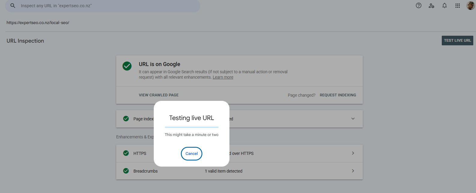
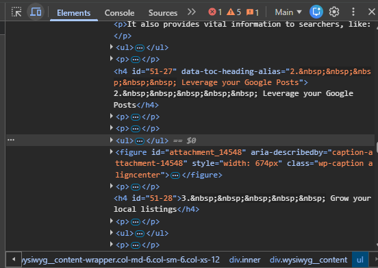
Chrome DevTools device mode.
What it is: a phone-preview built into the Chrome browser you already have.
How it helps: it lets you see and click through your site as if you were on an iPhone or a Pixel, instantly, without touching your phone.
How to use it: open your site in Chrome, press F12 (or right-click → Inspect), then click the little phone/tablet icon at the top-left of the panel. Pick a device from the dropdown and browse.
And the simplest, most honest test of the lot: pull your own site up on your actual phone, on mobile data with the wifi turned off. That’s the real experience your customers get. If it’s slow or fiddly for you, it’s slow or fiddly for them.
For anything deeper — a full crawl of every page’s mobile and technical health — that’s where a proper site audit comes in, which checks these signals across the whole site at once instead of one URL at a time.
Mobile SEO and Local Search
For most local NZ businesses, mobile SEO and local SEO are the same fight — and it’s where the real money is.
Think about who searches “emergency dentist near me” or “family lawyer Tauranga.”
They’re on a phone, often in a stressful moment, ready to call the first solid option that appears. “Near me” searches have exploded over the last few years, and the intent behind them is about as hot as it gets.
On a phone, the Google Maps pack — those top three local results with the map — dominates the screen.
It often fills the entire first view before a single normal blue link appears. Ranking there matters more than almost anything else for a local business.

That’s why the same fundamentals that win local search are the fundamentals of mobile SEO:
- A complete, optimised Google Business Profile — the listing that decides whether you show up in that map pack.
- Consistent name, address and phone number everywhere online.
- A fast, tappable website that loads the second someone hits it from the map.
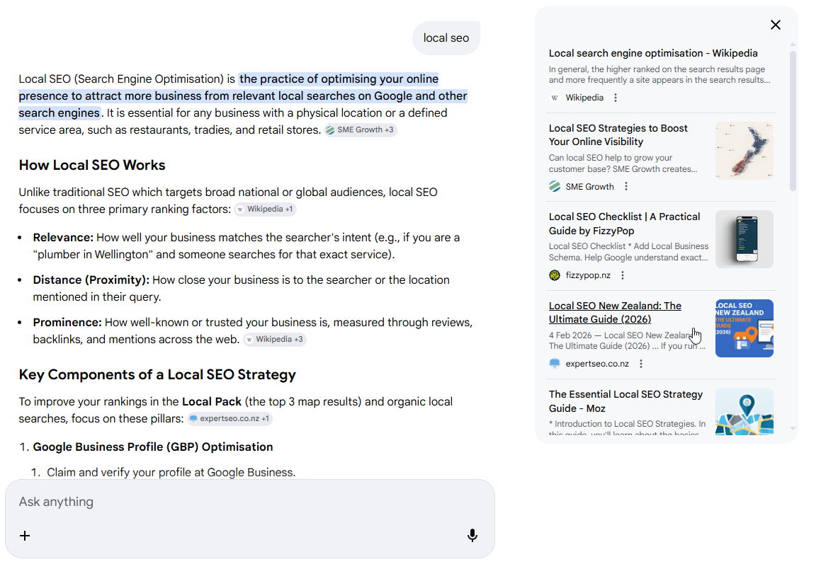
This is exactly the playbook that’s worked for us. Our own local SEO guide ranks number one in New Zealand for “local SEO” — above Ahrefs and Semrush, global tools with thousands of backlinks — on a domain less than a year old.

It’s also being pulled into Google’s AI Mode as a cited source — the new AI-generated answers at the top of the results.
If you run a high-value local service — a dental practice, a law firm, a mortgage brokerage — this overlap is everything.
Getting mobile right is how SEO for dentists actually turns a “near me” search into a booked consult.
And in a competitive market like Auckland, it’s the difference between owning the map pack and being invisible — which is the whole game for Auckland businesses chasing local customers.
When to Do Mobile SEO Yourself vs Hire Someone
A lot of this is genuinely DIY. You can check your design is responsive, compress your images, run PageSpeed Insights, and tidy up your pop-ups in an afternoon. For a small site, that alone can make a real dent.
Where it gets worth bringing in help is when the problems are baked deeper in — a slow site whose speed issues are stitched into the theme or the build, Core Web Vitals that won’t budge no matter what you try, or a competitive local market where everyone’s already doing the basics and you need to actually pull ahead.
That’s the kind of work we do every day.
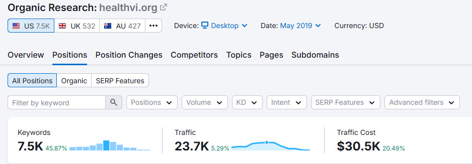
It’s the same process I used to grow a health website, HealthVI, from zero to over 20,000 monthly visitors — built with my former business partner and SEO mentor Ian Pribyl — and the same process behind Expert SEO outranking decade-old agencies on a domain that’s months old.
If your mobile experience is holding your rankings back and you’d rather have it handled than chip away at it yourself, that’s where SEO services comes in. We’ll find what’s actually dragging the site down on mobile, fix it, and build from there.
Mobile SEO: FAQ
Is mobile SEO different from desktop SEO?
No. It's one discipline. Google ranks the mobile version of your site for everyone, so optimising for mobile is optimising for desktop — you're improving the single version Google judges. Anyone selling "mobile SEO" as a separate service is overcomplicating it.
How do I check if my website is mobile-friendly?
Use Google PageSpeed Insights (read the Mobile tab) for speed and Core Web Vitals, the URL Inspection tool in Search Console to see your page the way Googlebot does, and Chrome's device mode to click through it at phone size. Then load it on your own phone on mobile data. Ignore any guide pointing you to Google's old Mobile-Friendly Test — it was retired in December 2023.
How long does mobile SEO take to show results?
Quick technical fixes — image compression, a faster theme, sorting out pop-ups — can lift your Core Web Vitals within days to a few weeks once Google recrawls. Ranking improvements from the wider work usually build over two to three months, in line with SEO generally.
Is SEO dead in 2026?
No. Search is changing — AI Overviews, more answers on the results page — but people are searching more than ever, mostly on phones. The businesses that show up fast and clearly on mobile are the ones getting found, whether that's in the blue links, the map pack, or an AI answer.
Recommended Reading
The full step-by-step process for getting a NZ site ranking, start to finish.
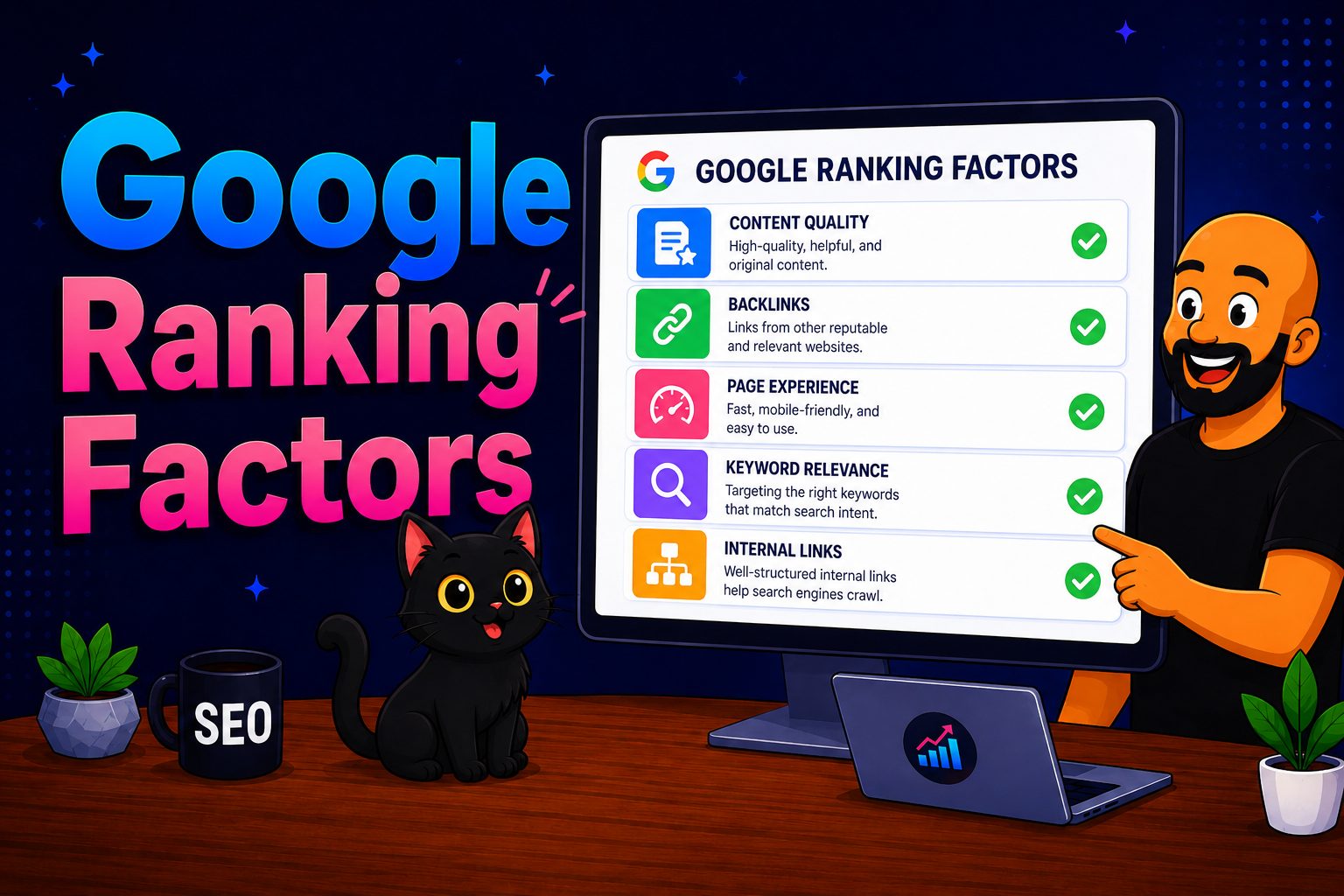
What actually moves rankings in 2026, and what's just noise.

The exact steps to win the map pack in your area.